A common question from our students is “Do I need to use the template provided by my university?” Whether that student is creating a poster or a presentation, or some other kind of science visualization, we like to encourage creativity and originality and prefer you not to use templates. However, if you ask a university employee working with communication or management, they will most likely answer “Yes, always” to the same question. So, who should you listen to and what are the arguments for and against using a template? Are there some situations where you must use it? Why do templates exist to begin with? Let’s start from the beginning...
The visual identity of a university
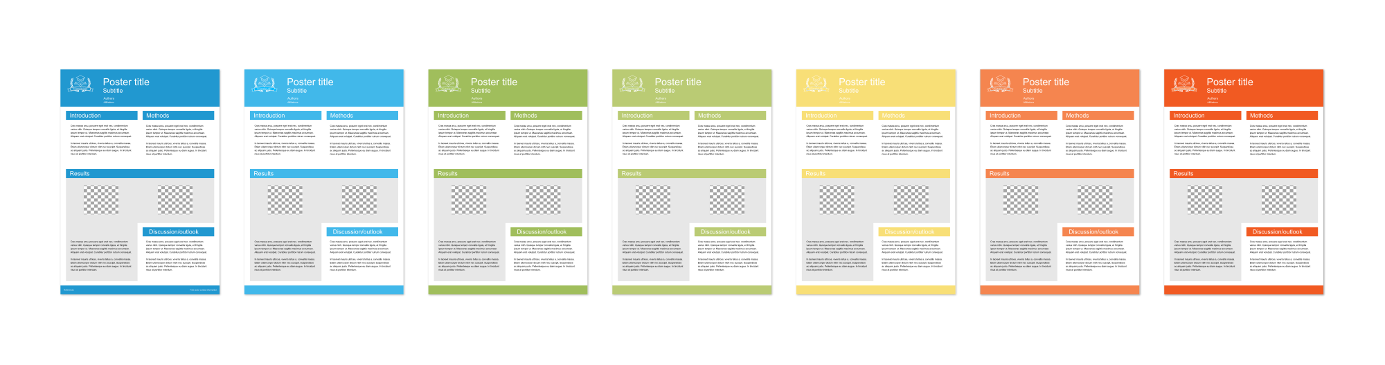
Universities typically establish a visual identity, also known as a graphical profile, brand profile, or brand identity. This identity comprises a logo and its variations, along with guidelines on usage. It usually also includes a designated main color and complementary colors, with specified fonts and, in some cases, unique typefaces. The visual identity can also extend beyond that to encompass elements like email signatures, photo rules, templates for posters and presentations, website layouts etc. You can often find the visual identity and templates on your university website (they are sometimes hidden in the internal employee pages). These guidelines are set to create a coherent appearance and unity across different platforms of communication within and outside the university.
The visual identity is very important for any type of company, both for communication and branding. Imagine if your favorite social media platform all the sudden changed both its name and logo. Wouldn’t that be confusing to you as a user? These things can be the (often subconscious) deciding factor for a consumer to trust a company or not. As you might understand, trust is especially important for a university. They need to have a consistent and professional look, to strengthen the overall brand and reputation. Reputation is extremely important when students make decisions on what program to apply for and for recruiting excellent researchers.
A visual identity might not be as important to all university employees and in all situations. In general it is more important the higher up the university communication hierarchy you go. For people in management and administrative positions, and for public appearances and advertising, it is extremely important. Unfortunately this also means that university templates are often designed with such occasions in mind. So you might want to use your university's template, to make your university happy, but you might also want to stand out and let your science be the star of your poster of presentation.
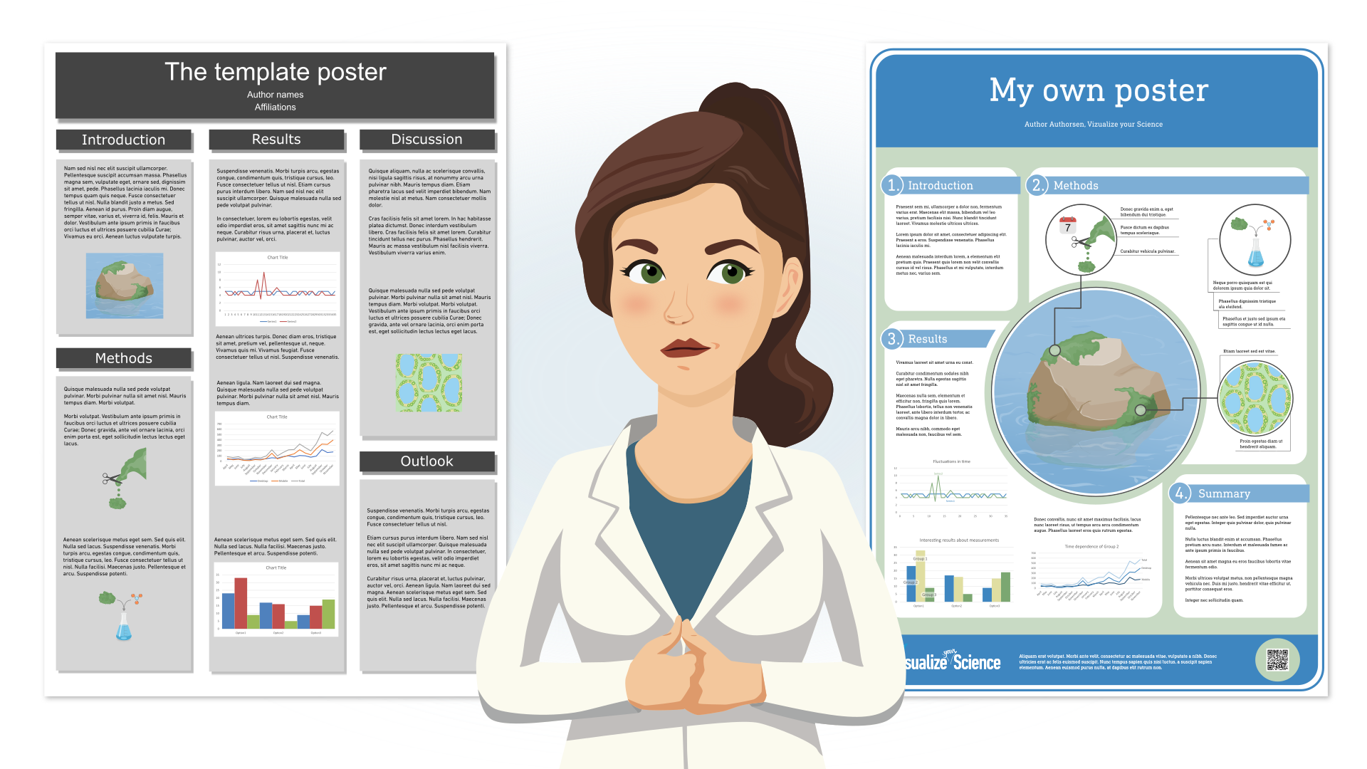
It is your decision to use the template or make your own presentation, poster, or other type of communication. But keep in mind that templates are just that, templates, and science communication is something that often requires a lot more effort and thought than just displaying your graphs or results in any kind of standardized way. If you truly care about communicating your research, templates are most likely not going to help you. If you only have half an hour to make a poster, using the template might be the only way to make it happen. Let’s have a look at some of the arguments for and against using university templates.
Pros of using a template
Here are some arguments for using a poster or presentation template:
- Quick and easy – If you have never made a poster or presentation before, it can feel a lot less difficult to use a template in the beginning. In case you have a very short deadline it can also help since you don’t have to worry too much about the layout. Some universities even have online tools where you can make your poster and send it to be printed, which can be easier to use than the poster creation software of your choice.
- Hard to mess up – Since a template usually consists of simple blocks or columns, it is easy to keep your work well structured. You can just copy text and images from your article into designated locations, and only if you try to squeeze in way too much information will it end up looking messy.
- Don’t have to think about layout and design – A well-made template can be perfect for what you want to use it for. Depending on how much effort was put into making it and how much flexibility the template allows for, you might save time not having to think about how to present and organize your contents.
- Good for the university brand – Maybe you are presenting your research to the public or to undergraduate students to interest them in the research conducted at your university. If the aim of your poster or presentation is to advertise the university, you (or rather, your university) can benefit from using the template.
- Creates trust – Your audience could trust you more as a representative of the university since they could recognize the design and layout style of the template. This can also backfire since the use of a template may seem like you did not put in much effort or, if the template is bad, you might be judged for it.
- Strength in numbers – If you are from a big research group where most people have a poster on display in a poster session and you are all using the same template, it will make you all stand out compared to the rest of the posters. This can make the group look big and influential.
Cons of using a template
Here are some arguments for not using a template:
- Quick and easy – Just as “quick and easy” can be used as an argument for using a template, it is one against it as well. Informing about your research is complex and you often need to spend a lot of time planning your story, the contents and how its best presented to communicate in the best possible way to a specific audience. Just copy and pasting from your article will not achieve that.
- Bad templates – Some universities know what they are doing when they make a template but there are also templates that are badly constructed or unsuitable. It might be a presentation template where there is yellow text on white background (impossible to read!) or a poster template where the title takes up a third of the poster (not ideal use of space). Or maybe the template is in a format or size that doesn’t fit with the conference specifications. In any case, you should not stick to a template that doesn’t work, it will distract attention from your research.
- One template to fit them all – Even a good template might not suit your communication purposes or your contents. Maybe the poster template is made for a poster containing 80% text, but you have a lot of visuals. Or maybe the template forces you to use fixed subheadings like in the IMRaD structure: “Introduction”, “Method”, “Results” and “Discussions”, but your poster will cover other topics. Maybe the presentation template only involves slides with bullet lists and leaves no room for showing the type of slides you want to use. You should not stick to a template if it doesn’t work with your contents.
- Limits creativity and science communication – The idea of a poster or a presentation is to communicate your message in a good and clear way. If you follow a standard way of doing so, you might miss out on doing it the best possible way.
- Mundane posters and presentations – Let’s face it, if all posters or presentations look the same, what is there to make your research stand out? You will have to work a lot harder on making your research stand out if you are using a template.
- As a PhD student or researcher, you are more important than your university brand – In the end, you must decide what to prioritize. Perhaps you want to spend as much time as possible in the lab or analyzing data, then using a template might be faster (even though it might not communicate your message in the best way). Or maybe you want to create a stunning poster that attracts attention as well as explains your research in a clear way, then, the template will simply not work. It’s also important to keep in mind that what is best for you and your research will also be what is best for the university in the end. This trumps the recommendation to use a template.
Summary
At Visualize your Science we strongly believe that most templates don’t provide you with anything more than structure and that most science communication requires much more and well-planned design that fits your research. It is important to follow university guidelines when it comes to their logotype and to always represent your university by showing your affiliation and the university logo together with other collaborations that might be connected to your research. If you take the time to learn how to make your own posters and presentations, you can communicate your research to other researchers in a better way which can lead to new opportunities and ideas for future experiments or collaborations. If you are curious to learn how to make better posters or presentations, you can check out our two courses Visualize your Science and Present your Science.
Header

Left aligned image with wrap-around text.
Lorem ipsum dolor sit amet, consectetur adipiscing elit. Vivamus semper lobortis risus id bibendum. Nulla sit amet magna ut felis tempor facilisis. Quisque scelerisque nunc at arcu volutpat lobortis. Cras pellentesque, lacus a scelerisque pellentesque, odio massa pharetra ligula, ut pharetra arcu tortor eget neque. Cras ut neque tincidunt, consectetur massa in, viverra tellus. Vestibulum laoreet sapien metus, vitae volutpat ipsum viverra vel. Suspendisse ligula nisi, aliquam ut velit ac, fringilla convallis nisi. Phasellus quis metus pharetra nibh finibus iaculis.
Lorem ipsum dolor sit amet, consectetur adipiscing elit. Vivamus semper lobortis risus id bibendum. Nulla sit amet magna ut felis tempor facilisis. Quisque scelerisque nunc at arcu volutpat lobortis. Cras pellentesque, lacus a scelerisque pellentesque, odio massa pharetra ligula, ut pharetra arcu tortor eget neque. Cras ut neque tincidunt, consectetur massa in, viverra tellus. Vestibulum laoreet sapien metus, vitae volutpat ipsum viverra vel. Suspendisse ligula nisi, aliquam ut velit ac, fringilla convallis nisi. Phasellus quis metus pharetra nibh finibus iaculis.
Right aligned image with wrap-around text.
Lorem ipsum dolor sit amet, consectetur adipiscing elit. Vivamus semper lobortis risus id bibendum. Nulla sit amet magna ut felis tempor facilisis. Quisque scelerisque nunc at arcu volutpat lobortis. Cras pellentesque, lacus a scelerisque pellentesque, odio massa pharetra ligula, ut pharetra arcu tortor eget neque. Cras ut neque tincidunt, consectetur massa in, viverra tellus. Vestibulum laoreet sapien metus, vitae volutpat ipsum viverra vel. Suspendisse ligula nisi, aliquam ut velit ac, fringilla convallis nisi. Phasellus quis metus pharetra nibh finibus iaculis.
Body text segment
Lorem ipsum dolor sit amet, consectetur adipiscing elit. Vivamus semper lobortis risus id bibendum. Nulla sit amet magna ut felis tempor facilisis. Quisque scelerisque nunc at arcu volutpat lobortis. Cras pellentesque, lacus a scelerisque pellentesque, odio massa pharetra ligula, ut pharetra arcu tortor eget neque. Cras ut neque tincidunt, consectetur massa in, viverra tellus. Vestibulum laoreet sapien metus, vitae volutpat ipsum viverra vel. Suspendisse ligula nisi, aliquam ut velit ac, fringilla convallis nisi. Phasellus quis metus pharetra nibh finibus iaculis.
Lorem ipsum dolor sit amet, consectetur adipiscing elit. Vivamus semper lobortis risus id bibendum. Nulla sit amet magna ut felis tempor facilisis. Quisque scelerisque nunc at arcu volutpat lobortis. Cras pellentesque, lacus a scelerisque pellentesque, odio massa pharetra ligula, ut pharetra arcu tortor eget neque. Cras ut neque tincidunt, consectetur massa in, viverra tellus. Vestibulum laoreet sapien metus, vitae volutpat ipsum viverra vel. Suspendisse ligula nisi, aliquam ut velit ac, fringilla convallis nisi. Phasellus quis metus pharetra nibh finibus iaculis.