At Visualize your Science most of what we do is about empowering researchers to explain their science in a visual way because images and other visuals improve both the understanding and the retention of the subjects explained. Some research fields have a broad and obvious visual language, chemists can explain their science by drawing molecules and reaction pathways, biologists can use images of the plants/animals/cells that they study, geologists can illustrate rock structures or the layers of the earth.
Other research fields have less tangible or more abstract subjects for which no obvious visual representation exists. Researchers from fields like computer science, theoretical physics, and mathematics sometimes struggle with the abstractness of their algorithms and concepts. Researchers from the fields of humanities, and social sciences such as linguistics, can have a hard time transforming their “texty” research into visuals. It is thus not surprising that in our Visualize your Science course we regularly hear the phrase “My research is only text, there is nothing to visualize.”
This blog is for those of you that struggle to find and see the visual aspects of your science.
Sometimes there is more to illustrate than you think
It sounds too simple, but sometimes there is more to illustrate then you think initially. You might have to take a deeper look at your research than say, someone who studies heart diseases (who is obviously using an evocative illustration of a heart in their poster), but even if the central object or concept in your research is difficult to illustrate, there might be different aspects of your science that can be expressed visually. Take a closer look at your introduction, why do you do what you do? Why should it be important to your audience? Can you illustrate the problem? Or maybe dive into your conclusions. What are the consequences of your results?
A straightforward way to help you find things to illustrate is to look for processes, as they can almost always be depicted as a workflow schematic. Since research itself is a process, you should be able to find some. This approach works particularly well for methods sections but can be applied to visualizing motivations, algorithms or in some cases, conclusions.
But how?
The illustration below shows the result of my attempt to illustrate this process.
(very meta, I know)
A straightforward way to help you find things to illustrate is to look for processes, as they can almost always be depicted as a workflow schematic. Since research itself is a process, you should be able to find some. This approach works particularly well for methods sections but can be applied to visualizing motivations, algorithms or in some cases, conclusions.
But how?
- Start by writing a simple text describing the part of your research that you want to illustrate.
- Take out two differently colored markers.
- Use one color to mark all the nouns in the text and the other to mark all the verbs.
- Each noun marked this way will become an icon in your process illustration and each verb will become an action illustrated by an arrow.
- Now all you need to do is draw the icons and pick an arrow design and arrange them in the correct order, and voila you have illustrated a process.
The illustration below shows the result of my attempt to illustrate this process.
(very meta, I know)
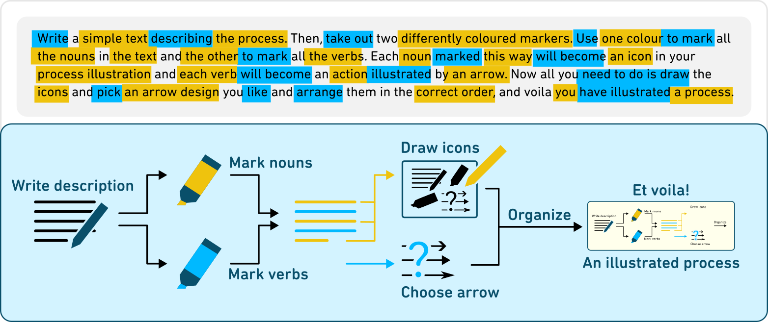
While you are putting together the schematic you will notice that some nouns feel less important, and some verbs are redundant. Look again at the example, I drew 7 icons and 7 arrows even though I marked many more words in the text. The text functions to get you started, but you are not obliged to follow it to the letter. It is up to you to make the explanation of the process as clear and straightforward as possible.
The added benefit of creating an illustration like this, is that it often replaces a dull dry method section full of text, thus you are doubly increasing the appeal of your poster.
The added benefit of creating an illustration like this, is that it often replaces a dull dry method section full of text, thus you are doubly increasing the appeal of your poster.
Use analogies
Sometimes your research is conceptually complicated, concerning things we don't know what they look like, or concepts that only exist in theory. It can be difficult, not only to visualize these concepts but also to explain them to someone outside of your research field. Although your direct colleagues might be happy to discuss these concepts in terms of algorithms or equations, communicating what you do to the outside without using jargon can be quite a challenge.
In these cases, it might help to use a metaphor or analogy to represent your research subject. An analogy can support you in explaining complex subjects but also provide you with something more concrete to illustrate or visualize. You can even combine the illustration of your analogy with more complicated descriptions of your research subject to come to a multi-layered explanation.
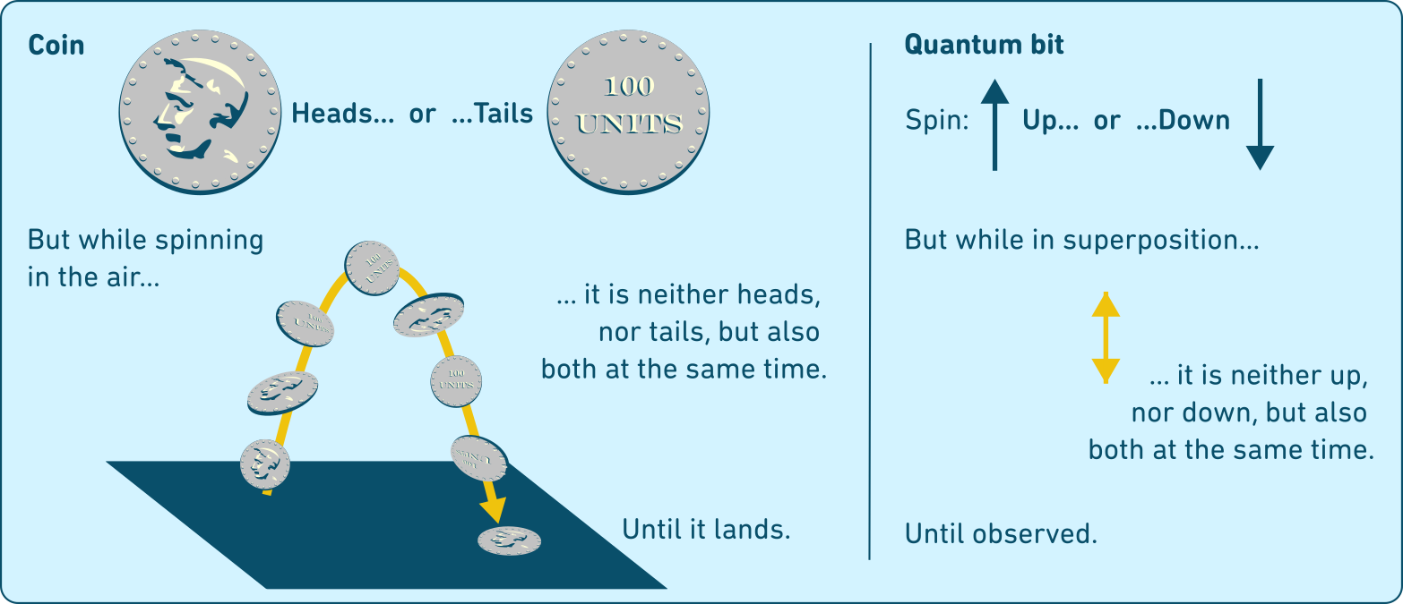
In the example below I have attempted to use the flipping of a coin as an analogy to explain the superposition of quantum bits. Notice how I use illustrations in the coin part (left), but keep it abstract on quantum bit side(right). By using alignment, position, color, and repetition, I try to express which parts of the analogy relate to parts in the concept.
In these cases, it might help to use a metaphor or analogy to represent your research subject. An analogy can support you in explaining complex subjects but also provide you with something more concrete to illustrate or visualize. You can even combine the illustration of your analogy with more complicated descriptions of your research subject to come to a multi-layered explanation.
In the example below I have attempted to use the flipping of a coin as an analogy to explain the superposition of quantum bits. Notice how I use illustrations in the coin part (left), but keep it abstract on quantum bit side(right). By using alignment, position, color, and repetition, I try to express which parts of the analogy relate to parts in the concept.
Many fields of science make use of analogies to explain various concepts to students. Feel free to use existing analogies when they fit but be aware that not all existing analogies are good. Developing an effective analogy for your science is hard work, but you will find that sticking to these three concepts is helpful: Relatability, simplicity, and concreteness.
- Relatability: the whole idea behind an analogy is that you ground the subject in something that is deeply familiar to the audience and that ideally works cross culturally. Like the use of the coin, an object that most people in most cultures encounter regularly, in our example.
- Simplicity: the more explanation necessary to establish the analogy the more people you will lose on the way. If you can choose between an analogy that requires only a short introduction and one that requires a long one, opt for the short one.
- Concreteness: keep it concrete, do not try to explain a difficult concept with another difficult concept.
Science visualization is more than illustration
Illustration of the objects and concepts that you study in your research is only one pathway towards explaining your science using visuals. If there are no obvious objects or concepts to illustrate why not focus on other types of visuals instead?
Data
Data and the data visualizations you make are an important part of your research; they are the foundations on which you build your theories and conclusions. It can make a lot of sense to give your data a central role on your poster. Think about the visual impact of newspaper spreads or magazine infographics. These journalistic works often contain beautiful data visualizations that allow the reader to explore the data themselves, to discover and dive deeper through several layers of information.
Just because you presented your data in a bar-chart or scatterplot in the journal article doesn’t mean that you cannot pour it into a different mold for your poster. What does your data look like? Can it be presented in a visually interesting way? Can you use it to tell the story of your research project? I highly recommend you have a closer look the "Data Viz project" here and "Information is Beautiful" here, to get inspration on the wide range of possibilities. A beautiful data visualization can be the centerpiece of a high-quality poster.
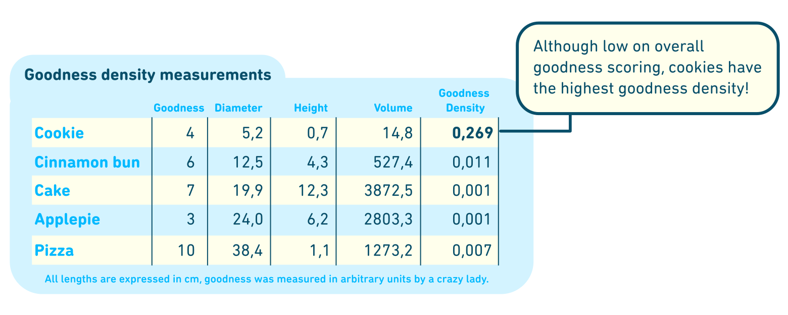
Tables
Some of you will be presenting your results primarily in tables. Tables can be a headache for the visualizer since your audience isprone to reading them like text. There are, however, things that you can do to help the audience to read your table as efficiently as possible.
Data
Data and the data visualizations you make are an important part of your research; they are the foundations on which you build your theories and conclusions. It can make a lot of sense to give your data a central role on your poster. Think about the visual impact of newspaper spreads or magazine infographics. These journalistic works often contain beautiful data visualizations that allow the reader to explore the data themselves, to discover and dive deeper through several layers of information.
Just because you presented your data in a bar-chart or scatterplot in the journal article doesn’t mean that you cannot pour it into a different mold for your poster. What does your data look like? Can it be presented in a visually interesting way? Can you use it to tell the story of your research project? I highly recommend you have a closer look the "Data Viz project" here and "Information is Beautiful" here, to get inspration on the wide range of possibilities. A beautiful data visualization can be the centerpiece of a high-quality poster.
Tables
Some of you will be presenting your results primarily in tables. Tables can be a headache for the visualizer since your audience isprone to reading them like text. There are, however, things that you can do to help the audience to read your table as efficiently as possible.
- Edit: Only show those columns and rows that are important to tell the story, and that support your main conclusions. A short table is easier to read than a big table.
- Space: Make sure that the text and numbers in the table have enough space around it. The closer each text-bit is to the edges of its box, the more crowded the table will feel.
- Avoid boxing: You do not need a black stroke around each number to separate it from the others, black strokes make a table look busier than necessary. You can employ alignment and colors to define separateness instead.
- Alignment & Significance: Make sure that the numbers are aligned in such a way that easy comparison within a column is possible, and that you use a correct amount (and not too many) of significant numbers. How many significant numbers do you really need?
- Colors: Many things in a table can be colored, title, headers, the numbers, the rows or columns, the background. You do not have to go crazy and color everything but applying the color palette of your poster to the elements in the table, will create a unified feel. Pay attention to legibility and contrast when coloring text!
- Mark the remarkable: Tell your audience what the interesting part of the table is, what is the main takeaway they should get from these numbers? You can mark the remarkable number either with thicker, larger font or a different color, or you can add a textbox that explains what is remarkable about it.
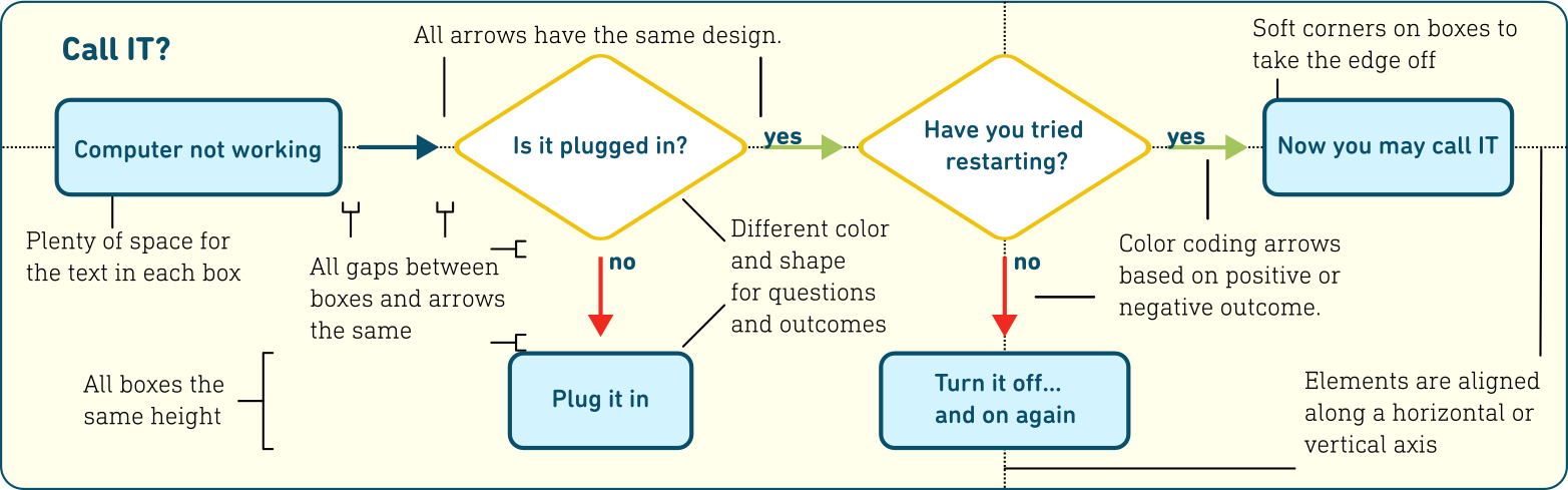
Flowcharts
Another non-illustration visual is a flow chart. Flow charts can be used to explain complex algorithms or decisions in simple logical steps. A well-made flowchart is nothing to frown upon, as an audience we can see the difference. Not only will a well-made flow chart be easier to read and therefore easier to understand, but it will also be more aesthetically pleasing. Plan the organization of your flowchart. Which elements and which connections are needed? Can you keep it understandable and readable? Think through choices of color, font, alignment, placement, and space. If you can unify the design of your flowchart with the overall design of your poster you will have one sleek visual on your hands.
Another non-illustration visual is a flow chart. Flow charts can be used to explain complex algorithms or decisions in simple logical steps. A well-made flowchart is nothing to frown upon, as an audience we can see the difference. Not only will a well-made flow chart be easier to read and therefore easier to understand, but it will also be more aesthetically pleasing. Plan the organization of your flowchart. Which elements and which connections are needed? Can you keep it understandable and readable? Think through choices of color, font, alignment, placement, and space. If you can unify the design of your flowchart with the overall design of your poster you will have one sleek visual on your hands.
Equations
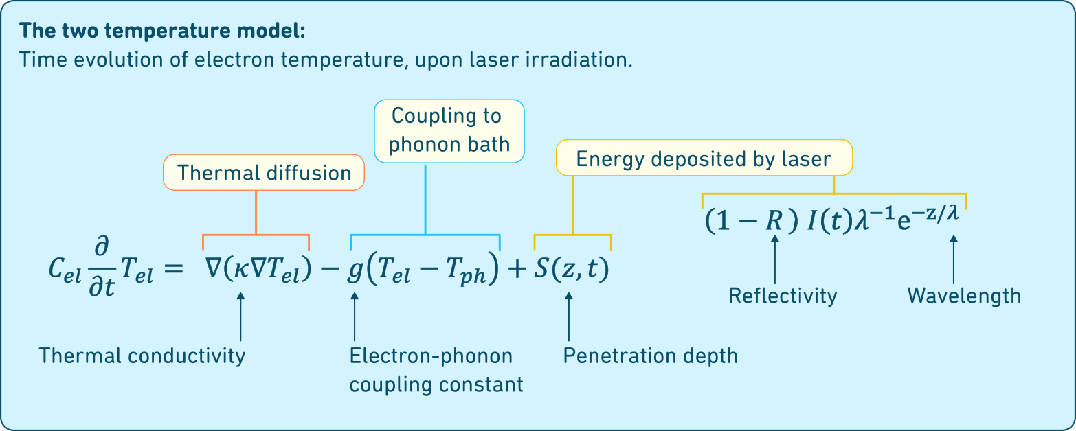
When it comes to research that is mathematical or rooted in calculations you often cannot get around displaying equations. Equations essentially already are visualizations of concepts or the relations between concepts. The problem with equations as a visual is that they are very abstract and therefore difficult to interpret for those members of the audience that do not have a pre-existing knowledge of the visual language involved. Even an audience within your field and an aptitude for reading equations might be helped along in their understanding and appreciation by a visually constructed explanation. In the figure below we show an example of how you can use a visual explanation of an equation.
Finally, if none of these suggestions helped you forward and you still sit with a poster that only consists of text…
Good Graphic Design
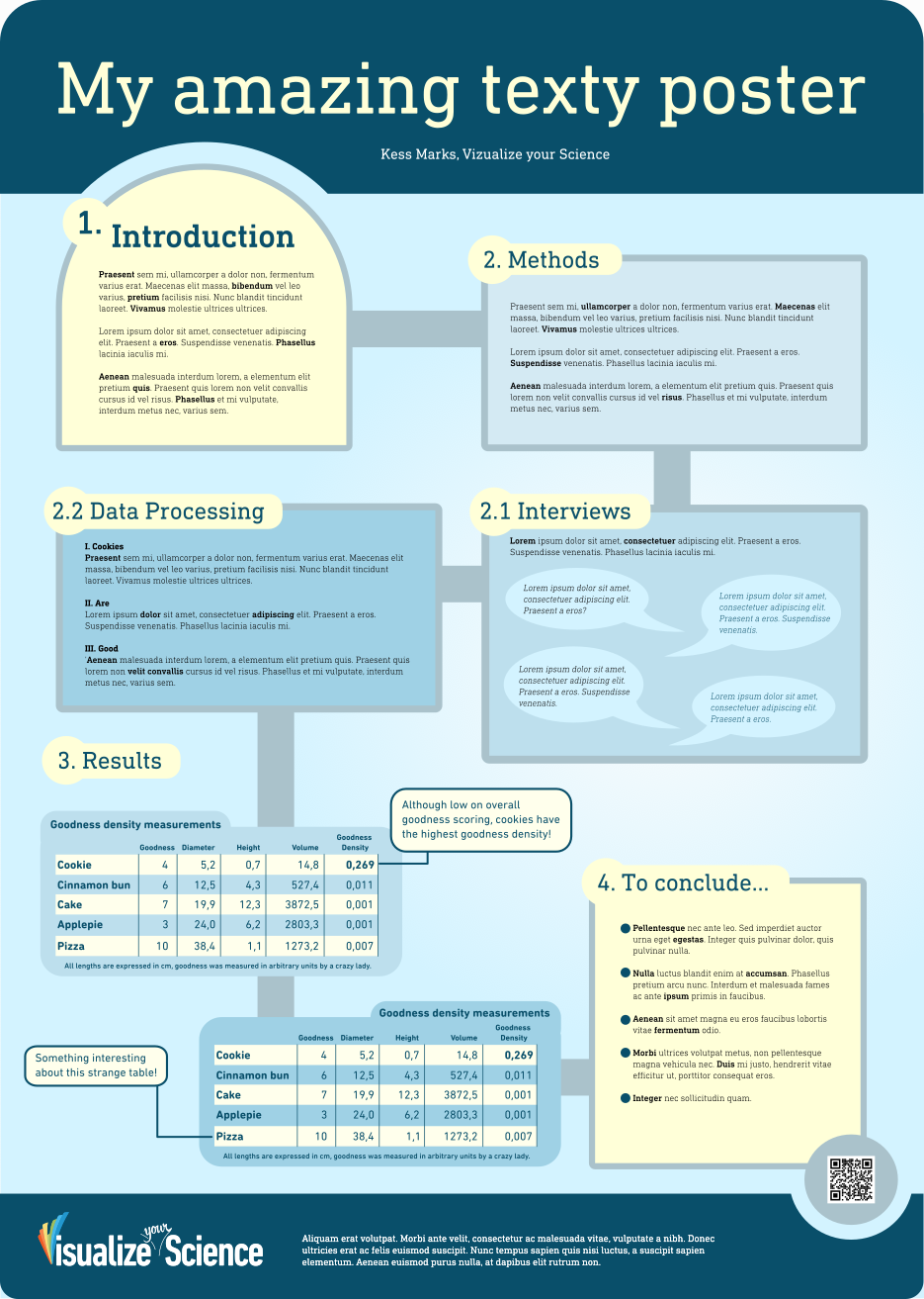
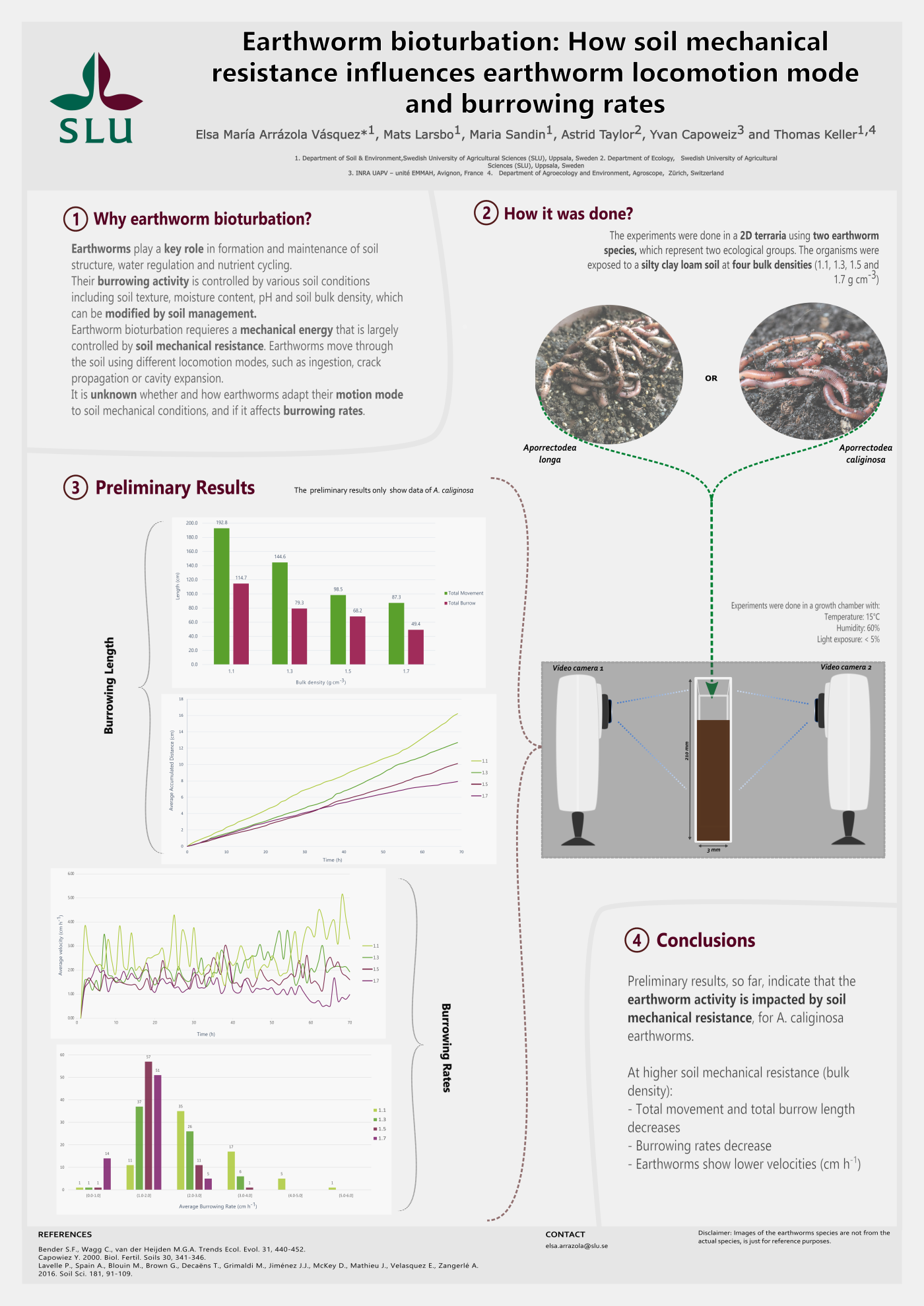
A poster that is only words can still be made more accessible and more aesthetically pleasing by using good graphic design. Just because you do not have an illustration to put as an entry point doesn’t mean your poster cannot have one. Even if the content of a poster is only text you can show the audience that you care about communicating the information. Make sure that all the text is legible, choose a pleasing font and color palette. Edit your text several times to ensure that the text reads as naturally and logically as possible. You can use layout to create visual interest in your poster. Don’t simply dump the text on the page but create nice looking text boxes that you link logically with arrows or lines clarifying the reading order. You can select witty titles for your subsections so that even though people are mainly reading, you give them a brain break from the serious text info-dump. The poster to the right is my attempt at creating a “texy” poster using graphical
design to create an entry point, flow, and exit point.
design to create an entry point, flow, and exit point.
To Conclude...
Science visualization is hard and for some sciences it is even harder. But that doesn’t mean that it is impossible, it simply requires more work in the conceptual stage, figuring out what things can be drawn, whether things can be explained using icons, or whether your science can be expressed using analogies. Figuring out how to make your data visualization the center point of your poster or how to create a visual explanation of your equations. Sometimes it can feel unfair that it is more difficult for researchers from certain fields to express their research visually, but we can also see it as an opportunity to develop the visual language of our field. And we can see it as an opportunity to explore our research in a way we have not done before .
In the end not everything needs to be visualized, we can aim for a balance between visuals and text. The challenge is not to make each part of your poster visual; it is to explain your science in the most efficient way. Sometimes it will be with visuals but sometimes it will be text. Most often your poster will contain a combination of both.
In the end not everything needs to be visualized, we can aim for a balance between visuals and text. The challenge is not to make each part of your poster visual; it is to explain your science in the most efficient way. Sometimes it will be with visuals but sometimes it will be text. Most often your poster will contain a combination of both.