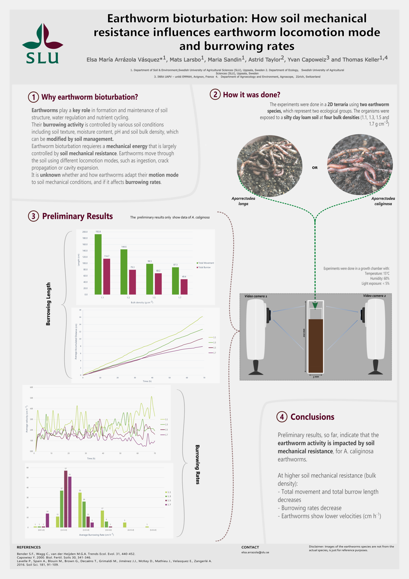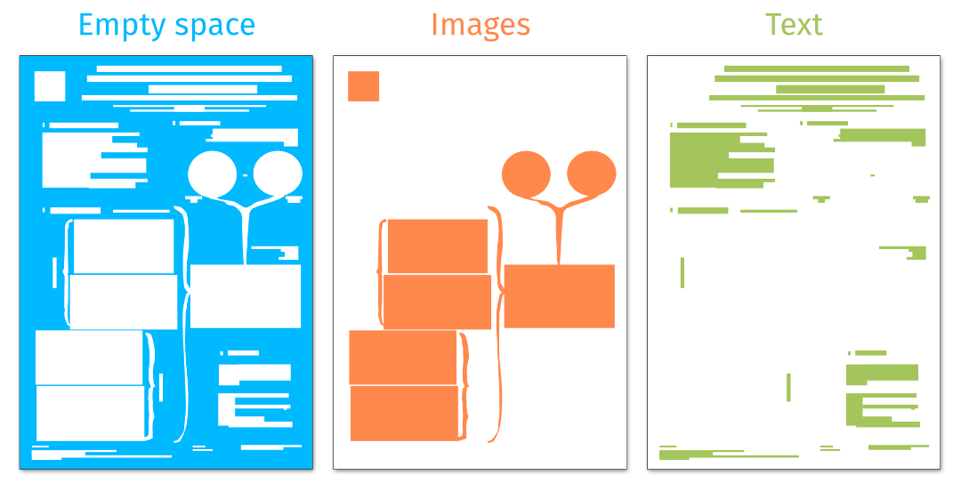
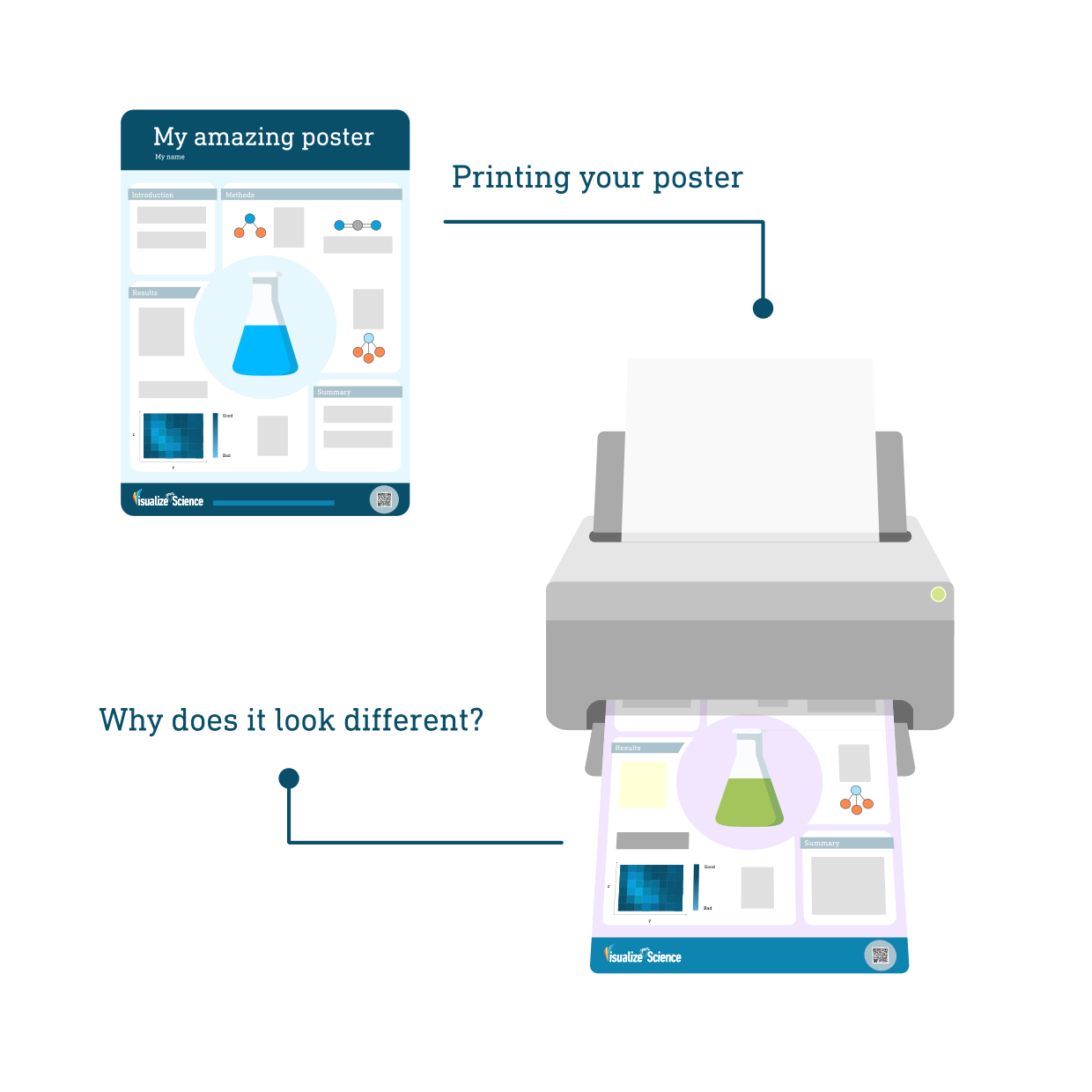
We have all been there; You designed a nice-looking poster for a conference and the printed version comes back from the printer’s not looking like you expected. It could be a nice, soft red that now looks blood red or orange, or maybe the contrast between the text and background is completely gone. “It looked so nice on my screen!” You are not alone and, as a matter of fact, this is an issue that professional designers deal with as well. Here are a few tricks you can use to improve the outcome of your prints.
Color models
The first and most important thing to realize is that what you see on your screen is never going to look exactly like what gets printed. Colors are generated in different ways on a computer screen than when they are printed. On a computer screen or monitor, colors are generated by additive mixing of red, green, and blue. This color model is called RGB from the first letters of each color. When red, green, and blue light is mixed in equal proportions, white light is created. The absence of light creates black and all other colors are created by combining these three colors in different proportions. When printing, colors are instead generated by a subtractive color model and most often the CMYK model. Here, the letters stand for cyan, magenta, yellow, and black. These colors are combined to make black but often to a poor result which is one of the reasons black ink is also used to make prints look better. Black ink is also used to save money since we often print black or grayscale. RGB typically has a broader color range than CMYK. To compensate for this offset printing is sometimes used instead of CMYK. Offset printing makes use of additional colored inks which can broaden the variety of colors that can be printed.
As you probably understand by now, RGB is used for graphics that will be displayed digitally and CMYK most often for printing. The color models are implemented as color formats and profiles a in digital graphics or image files. The color format (RGB, CMYK or e.g., grayscale) is decided by your intended use of the graphics and the color profile is the numerical model used to generate the colors within the format. You usually do not have to care about color profiles unless your printing service asks you to.
Your computer screen
When looking at your poster on a computer screen there are a lot of factors that affect how the colors look. The quality of screens varies a lot and different screens are better at different things. The settings of your screen such as brightness and contrast will also affect how your poster looks. The color profile used to save or export your poster in can affect how the colors appear on different screens. Additionally, the color accuracy of your screen diminishes over time and to make sure they display colors in the best possible way screens need to be re-calibrated every now and then. You will probably find that your poster will look different on your phone or coworker’s computer screen which can be quite confusing. If you are not a professional designer or illustrator, you might not want to spend too much time thinking about these things. Therefore, we have made the following overview of a few quick tricks and things to consider when creating your poster:
Colors
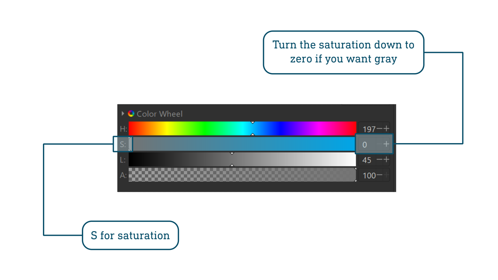
Black, white, and grays: Make sure your black is black, white is white, and gray is gray, not containing any color (bring the saturation, S, down to zero).
Colors that can be tricky to print correctly: very dark red, green, and blue, very bright (close to white) colors, metallic and neon colors. If you want to or need to work with colors that are difficult to print it could be worth paying extra for offset printing. Talk to your printing service to find out how to adapt your document for this.
Gradients and blurs
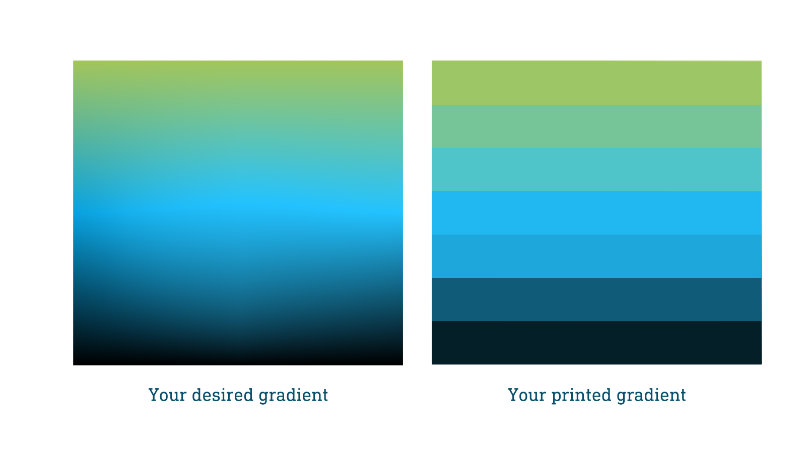
If your poster contains gradients or blurred objects you should be extra careful. Gradients and blurred objects can become “stripy” if the resolution of your saved document is too low. The recommended resolution for printed posters is usually 300 dpi but always check with your printing service to see what they prefer. For simple graphics, 150 dpi could be enough and for more advanced posters containing gradients, blurs, and other more detailed objects, 400-500 dpi might be needed.
Text
Thin letters or parts of letters such as serifs can disappear when the background color bleeds into the text. This is especially problematic for white text on colored and dark backgrounds. To prevent this from happening, choose a thicker font, or make the text bold or larger in size.
Saving and exporting your document
The standard format for printing a poster is PDF but check with your printing service what format they prefer. Exporting your document as a PDF will ensure it won’t be compressed as opposed to some other formats like JPEG or PNG.
The resolution of your document should in most cases not be less than 300 dpi when saving it for printing. Higher resolution could be good if you have a lot of gradients or other complicated drawings or detailed patterns. It is also important to set up your document in the correct size from the beginning to avoid mistakes when having to scale up your poster before exporting it.
When you have exported or saved your document it is important to always open the file and look at it. Strange things can sometimes happen when you save your document, especially if you have imported photos or vector graphics from other files. If things do not look as they should, it could be fixed by embedding imported objects into the file or by reducing the number of layers and grouping objects together. If your text looks strange you can try to embed your fonts or convert your text to paths when exporting as a PDF. To not look at your final file is one of the most common mistakes made and is easily avoided by a quick check before sending the file off for printing.
Color profiles
Make sure you work in CMYK color format from start to finish (unless the printing service tells you differently) and that any imported graphics are also saved in the same color profile. The most important thing is to not mix the two color formats.
• In Affinity Designer you can set the color format when creating your document. You can also change it later by going to File -> Document setup -> Colour.
• In Adobe Illustrator you can set the color format when creating your document and change it later by going to: File -> Document Color Mode -> CMYK
• Inkscape unfortunately does not support CMYK colors yet (as of version 1.3). What you can do is to work in RGB colors and export your finished poster as a PDF file. You can then convert the PDF to CMYK using a separate program. There are many programs available to do this and one option that is easy to use Scribus which you can download for free here. It’s a bit of an inconvenience, but since both programs are free and open source it’s worth the bit of extra work on our side.
If you work in RGB your printed poster can end up with colors that are a bit less vibrant and look bleached compared to what you see on your screen. Your printing service could also ask you to work in a color profile that matches their specific printer, always check with them before you send your poster for printing.
• Color profiles can be set in connection to setting the color format in Affinity designer.
• In Illustrator you go to: Edit -> Color Settings.
• In Inkscape you can set it in the document properties under color.
Proof/test print
The best way to make sure your print looks good is to order a test print. This can be done in a smaller size than your actual poster which will bring down the cost a lot. A lot of printing services do offer free test prints. The only thing you need to do is make sure your poster is ready at least a week before your deadline so that you have time to test print and make adjustments accordingly. This might be the biggest challenge!
One other parameter to consider is the paper quality. Different paper qualities reproduce colors differently and the easiest way to handle this is to talk to your printing service and listen to their advice. You might want to print a poster on canvas so that you can fold it and fit it into your luggage when travelling but that will affect how the colors look depending on what canvas is being used. If you don’t have the option to test print the safest bet is to go for matte paper quality.
Another thing to discuss with your printing service is the actual size of the poster. Professional printers use something called a "bleed” this is an area outside the document that will be trimmed off after printing and it’s there to account for the movement of the paper and possible bleeding of the ink outside the document area. To account for this, you might need to add extra margins around your poster. The most important thing is to ask what applies in your case. It could be wise to not place very important objects close to the edge of your document for this reason.
Summary
It doesn’t have to be that complicated to make sure your printed poster looks good. Many universities or departments have their own printing service or a company that provides the prints. Always check with them before you start creating your design:
- what color format and profile to use
- what the size your document should be
- whether they print with additional margins or not
- what file format they want you to provide your poster in
- what type of paper they use and how that affects your outcome
- if they offer a test print
- if there are any other specific requirements or tips that they can offer
Always be careful about what colors you pick, make sure they look good together and keep in mind that they will not always look like they do on your computer screen when printed.
Finally, remember that if you have made a well-designed poster, slight changes in the printed colors will probably bother you more than anyone else so it’s not the end of the world.
Now you know what to think about when printing your poster. In case you want to learn how to design a poster that both looks good and communicates your research in a clear way, have a look at our Visualize your Science course.
Good luck with your poster making and printing!
Now you know what to think about when printing your poster. In case you want to learn how to design a poster that both looks good and communicates your research in a clear way, have a look at our Visualize your Science course.
Good luck with your poster making and printing!