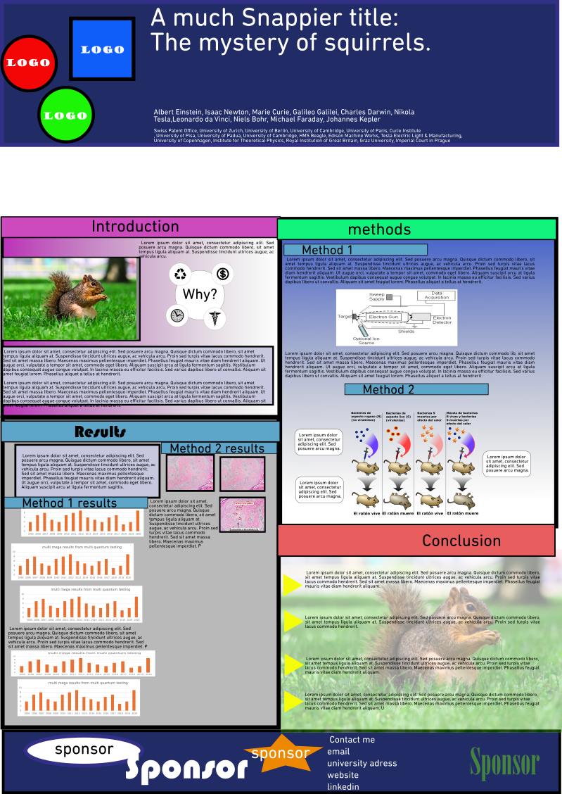
Messy posters are ineffective.
In our world of science communication, posters play a crucial role in presenting research findings and engaging audiences. However, the effectiveness of a science poster can be significantly diminished by clutter and visual noise.
Conference season is upon us, so let’s review some steps you can take to declutter your poster!
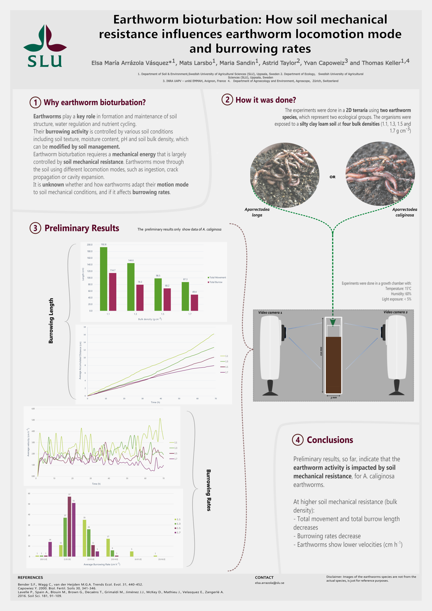
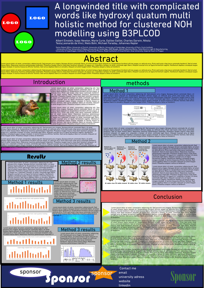
To illustrate the de-cluttering steps, I made a not-so-great imaginary poster using images from Wikimedia commons, made-up data and lorem ipsum text. However imaginary this poster is, it is inspired and representative of the many cluttered posters I have seen in my career as researcher and science communicator.
Check the carousel below to see the poster transformations from not-so-great to decluttered! And continue reading if you want to learn the clean-up steps I applied.
Conference season is upon us, so let’s review some steps you can take to declutter your poster!
To illustrate the de-cluttering steps, I made a not-so-great imaginary poster using images from Wikimedia commons, made-up data and lorem ipsum text. However imaginary this poster is, it is inspired and representative of the many cluttered posters I have seen in my career as researcher and science communicator.
Check the carousel below to see the poster transformations from not-so-great to decluttered! And continue reading if you want to learn the clean-up steps I applied.
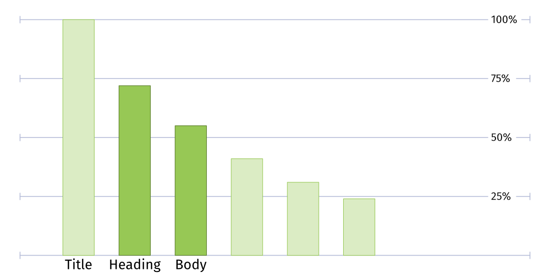
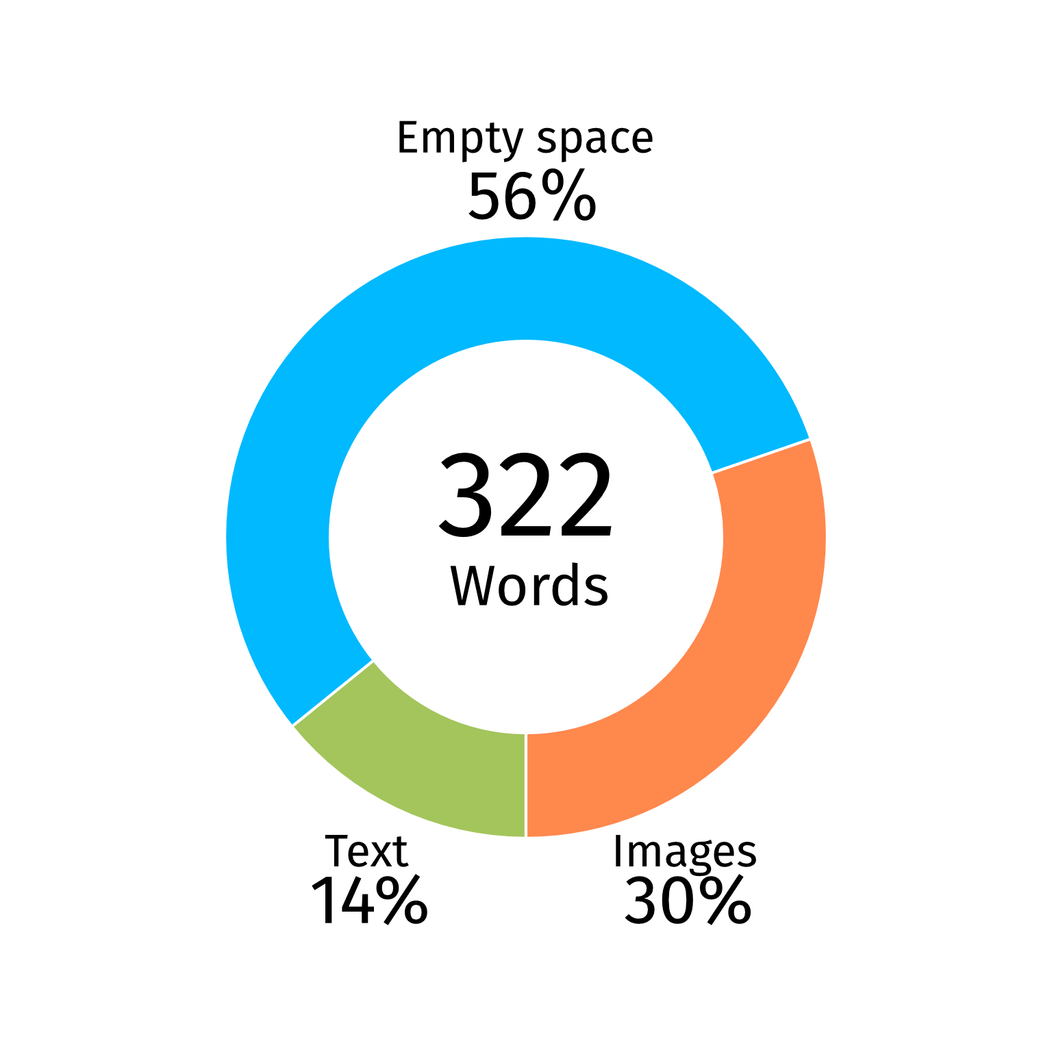
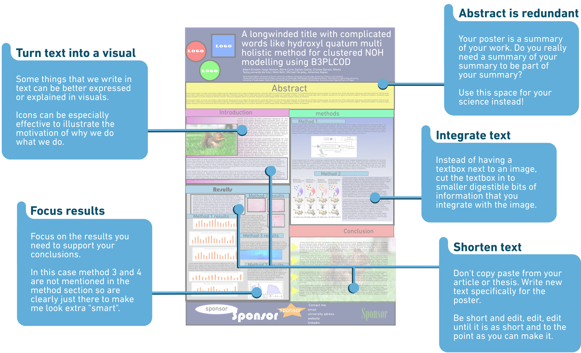
Step 1 Reign in the content
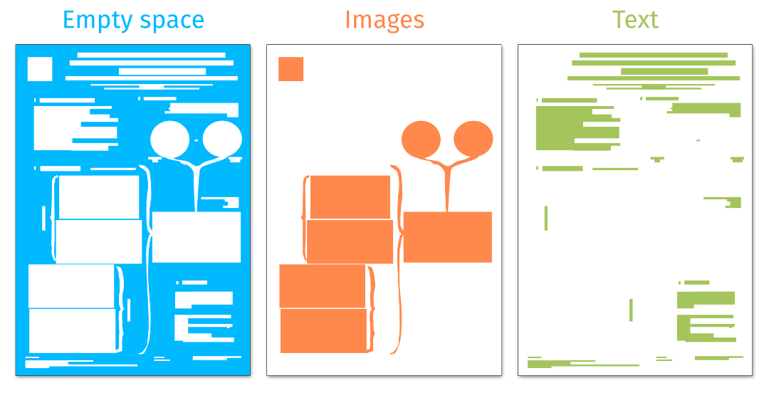
The biggest source of clutter is often that there is simply too much information to comfortably fit on the poster.
It is understandable that we as scientists wish to present every single result that we have worked so hard for in the lab and/or in the field. However, most of the time this isn’t the best way to communicate our research and, in fact, by giving people more things to look at, you ensure that fewer people will actually look at them.
So review, redact, and edit. Does all content need to be there? Probably not!
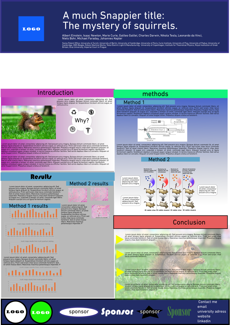
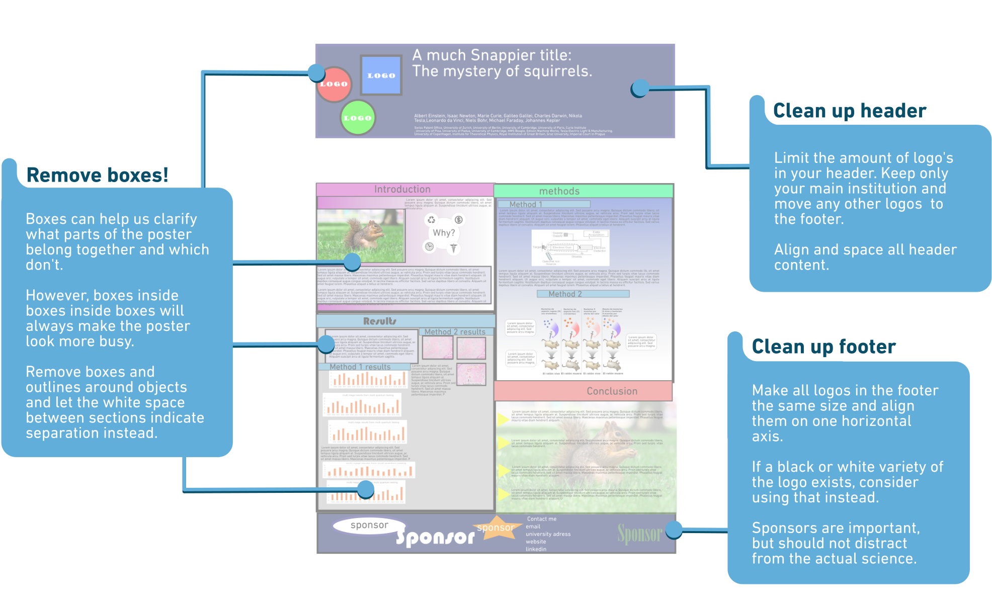
Step 2 Organize
Just like in the real world, a lot of clutter comes from things not being in the right place. When content is placed haphazardly on the poster it becomes more difficult to discern what information is important to the narrative and what isn’t.
Often, we use boxes to indicate which information belongs together, but if content is placed with care, we can use the white space between sections and proximity of objects to indicate what belongs together and what does not, in a much calmer way.
So, place stuff where it belongs and preferably not in boxes.
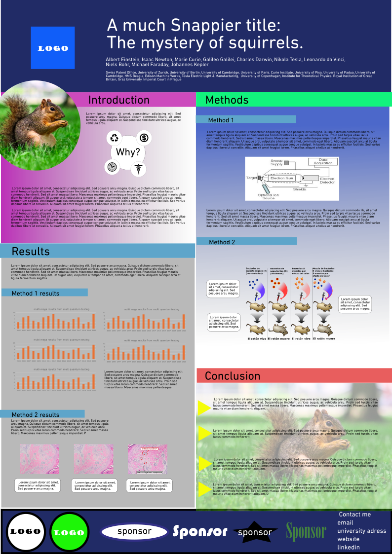
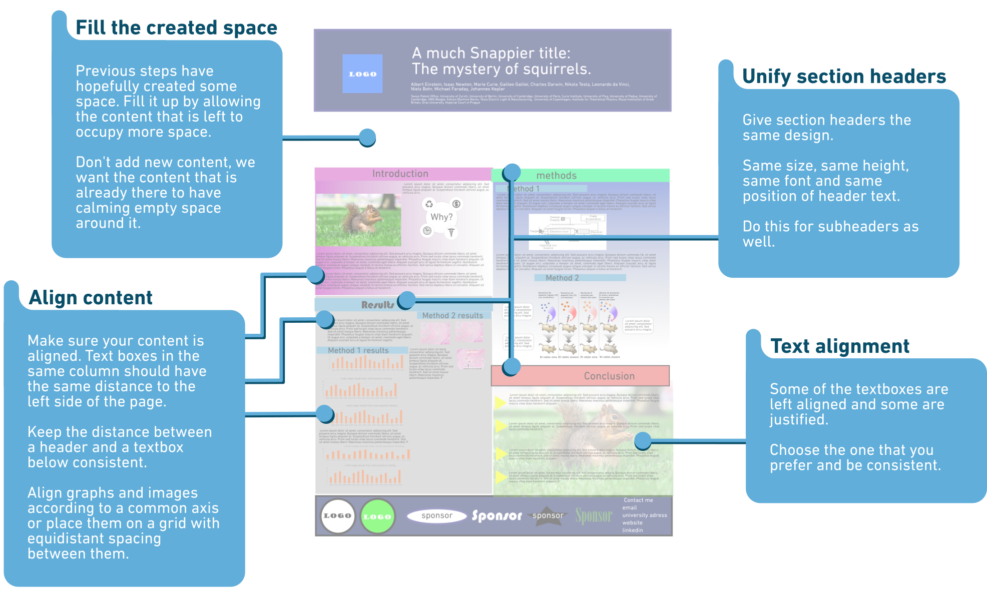
Step 3 Align
The presence or lack of organizational patterns also greatly influence the perception of a poster. While alignment and symmetry will instil a sense of calmness in the viewer, the opposite is true for misalignment, which creates visual noise making the poster feel cluttered. A lot of appeal can therefore be gained by having a clear margin and maintaining a consistent distance between consistent elements.
So, align, align, align and be consistent.
So, align, align, align and be consistent.
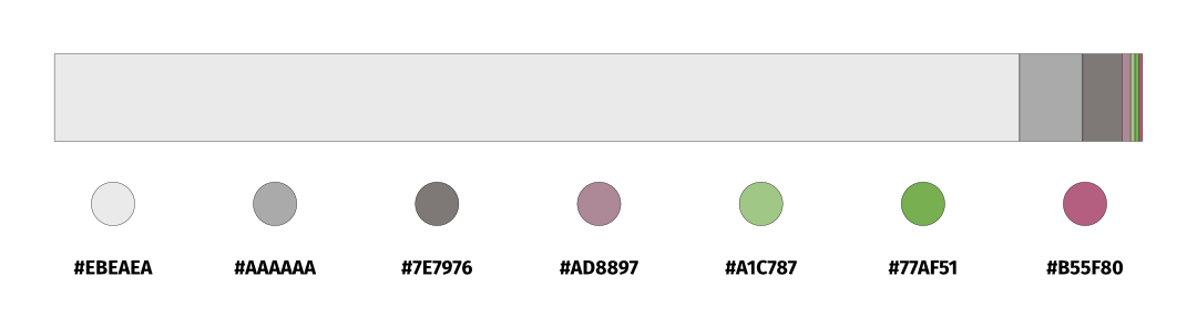
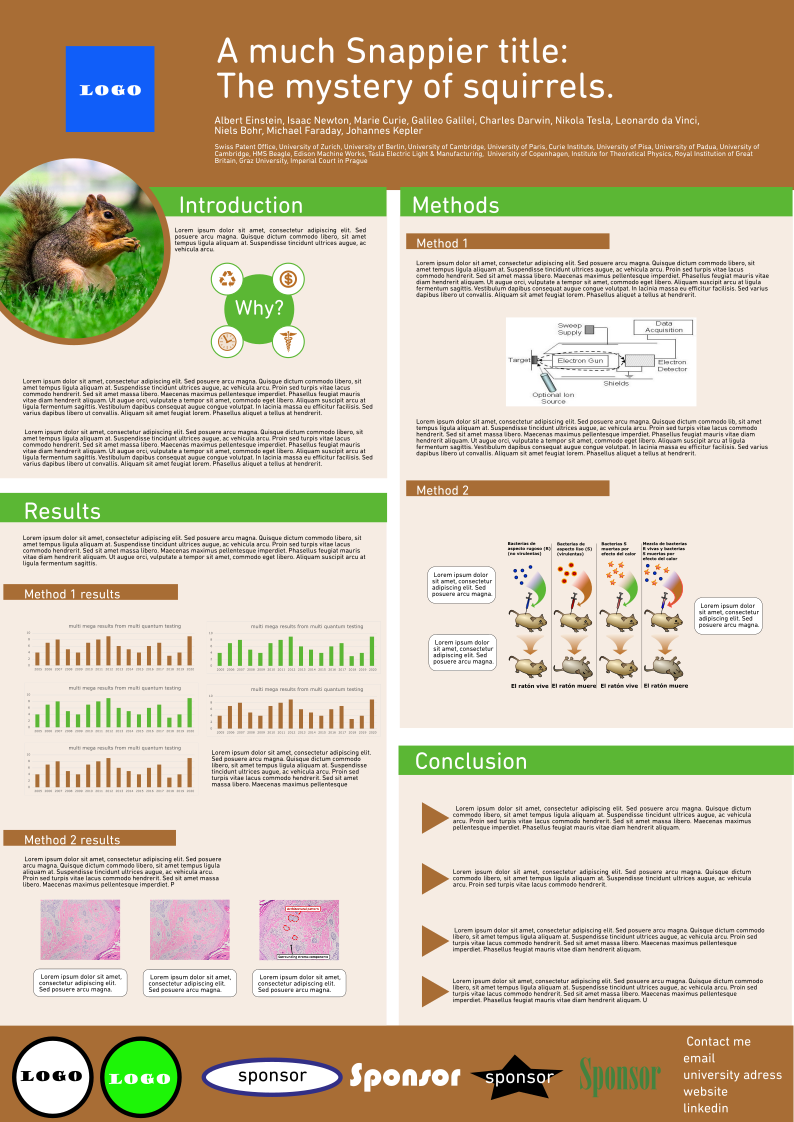
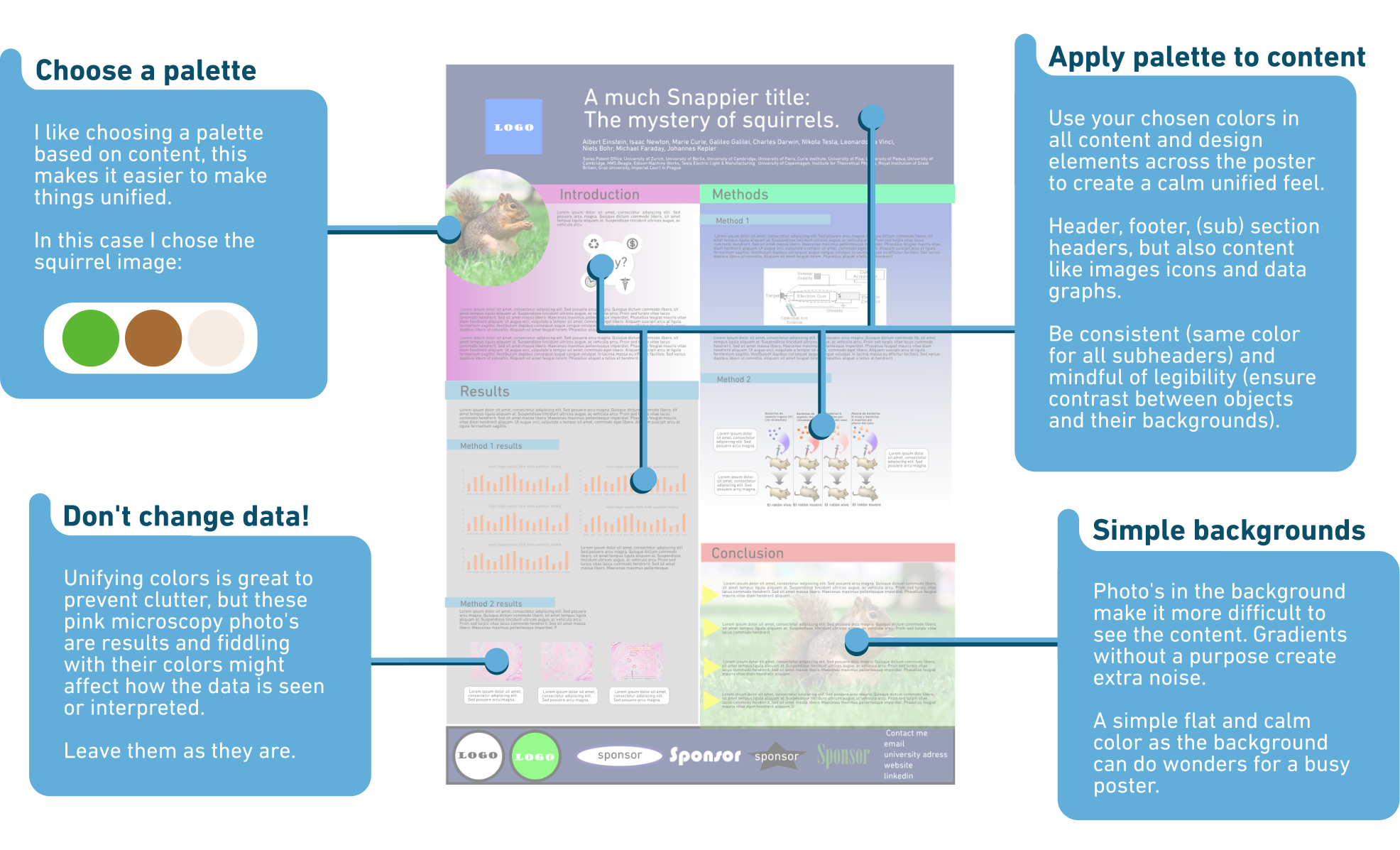
Step 4 Unify colors
Colors are often the first thing we perceive of a design and the one thing we remember most vividly. They create a mood, can organize, draw attention and emphasize. The use of too many randomly applied colors creates an incoherent and chaotic mood, where your audience doesn’t know where to look and what is important. In extreme cases, poor color choices can even obstruct us from properly seeing the content. This all creates a lot of visual noise that we can fix by unifying the colors, limiting the colors in our palette and applying said palette to all elements in our poster.
So, choose and apply colors with consideration.
So, choose and apply colors with consideration.
To conclude...
Following the steps above will most certainly result in an improved and cleaner poster.
However, remember that there are many other aspects of good visual communication that shouldn’t be neglected when creating posters. Graphic design, information design, visual storytelling, color theory, composition, flow, etc.
If we want to take our poster from a better version to the best version, we must apply all of them.
Decluttering is just one step to poster success!