Inspiration is everywhere
Sometimes we find color inspiration outside our research in the form of photos that give off a vibe or a feeling we would like to transfer to our poster. Whether we took the photo ourselves or if we found it on the internet, something makes us like these colors. In this blog I explain how I would go about creating a palette based on a photo.
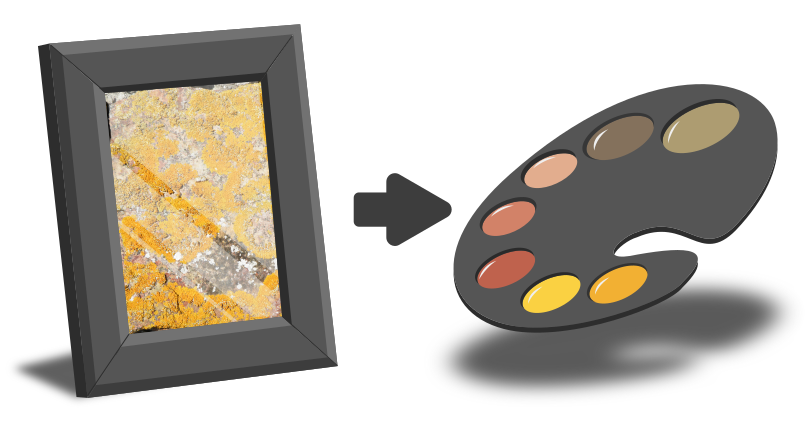
Here is a photo of lichen on a rock I found on summer holiday.
Here is a photo of lichen on a rock I found on summer holiday.
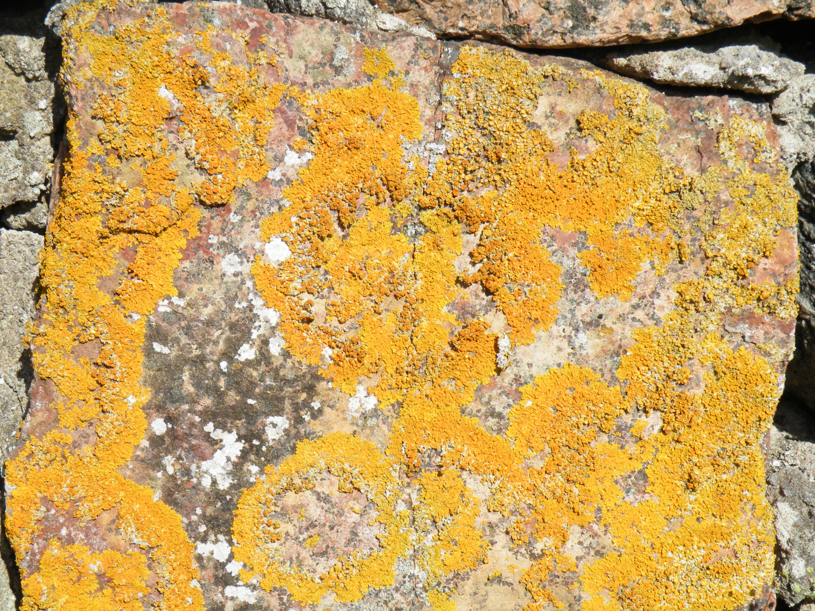
I absolutely love the vibrancy of that orangy yellow and the combination with the softer reds and brown from the rock.
When you want to create a palette based on a photo there are a ton of online apps and websites that you can upload your picture to and get a palette in return.
I prefer to do it myself for several reasons:
1. I know better what I want from the photo
2. I will have complete power
3. It is pretty easy and fast
I know better what I want...
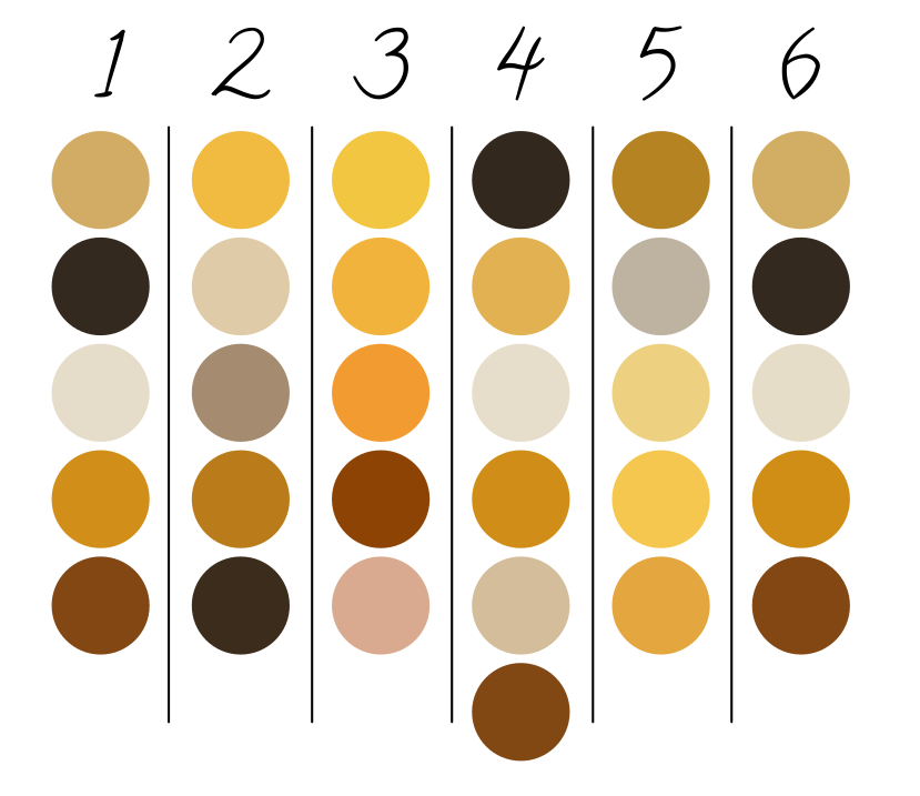
To the right you see the palettes extracted from my photo by six different online color pickers. All find something yellowish, something brownish and something beige. But only one (number 3) captures the vibrancy of that yellow orange lichen that intrigued me. None of them captured that reddish tone of the rock. It makes sense, there is not that much area covered by the red, so the algorithm behind the extraction doesn’t see it as important. Four of the websites pick a really dark color which I assume comes from the dark areas of shadow between the rocks on the edges of the photo. To me those dark areas are absolutely unimportant, but the algorithm doesn’t know that.
I have complete power...
I can tweak the website color pickers (some of them at least) to get closer to what I want. Some will let me point out the important areas, others will allow me to add more colors in the hope that at some point it will also find the red I liked. I could even crop my image before uploading to get rid of the dark areas in the hope that I will avoid those dark colors. But because each website is like a black box, I have no idea what it exactly does, my fiddling will be trial and error and it will be more work than one would think to get to the palette I want. If I do it myself in drawing software I get exactly what I want and probably faster.
It is pretty easy...
Most drawing software have a color picker function with which you can hover over your photo and click to select a color. I usually start with creating several circles (you may use squares too, I’m just used to my circles) of one flat color. Then I will pick colors and assign them to the circles to build the palette. Simple as that.
Hopefully I have convinced you to color pick yourself instead of relying on an online service.
When you do so here are three tips:
Hopefully I have convinced you to color pick yourself instead of relying on an online service.
When you do so here are three tips:
Tip 1: Identify
Before you pick, try and identify which colors and which color interactions you find compelling in your photo.
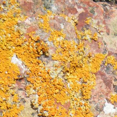
For me it is the vibrant yellow and orange, and it’s interaction with the muted red parts in the rock that I love. In the image beside here I show a zoom-in to better see those reds in the top right corner of the photo.
For me it is the vibrant yellow and orange, and it’s interaction with the muted red parts in the rock that I love. In the image beside here I show a zoom-in to better see those reds in the top right corner of the photo.
Tip 2: Be aware of pixels
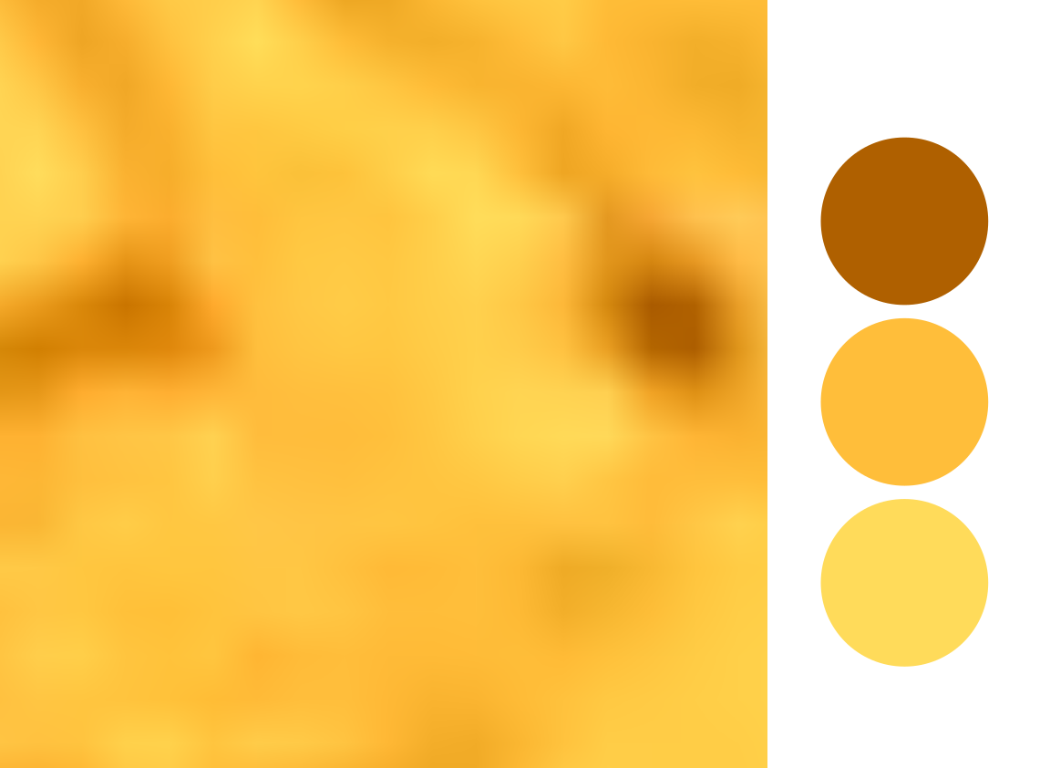
If you use the color picker in your drawing software it usually picks the color of the one pixel you click. Especially in high resolution photos, an area that looks homogeneous to us when zoomed out, may in fact contain pixels with widely different colors. So, depending on your zoom level and where you click you might get widely different results, as shown in the image to the left where I zoomed in as much as possible on the yellow lichen.
One way to remedy the “randomness” is through picking by averaging several pixels from one area (because that is what our eyes are also kind of doing). Most drawing software will have a way to do this. In Inkscape (which I use) you can simply click and drag with the color picker to create a circle, it will average all the pixels within that circle. In Affinity and Illustrator you can change the size of the area that is picked from in the color picker settings. I feel picking based on area usually returns more reliable results.
Tip 3: Adjust!
From my personal experience, picking while averaging sometimes adds some unwanted (or unexpected) “greyness” or “dullness”. In that case, simply move the saturation slider up just a tad to get to the color you want.

Let's try it!
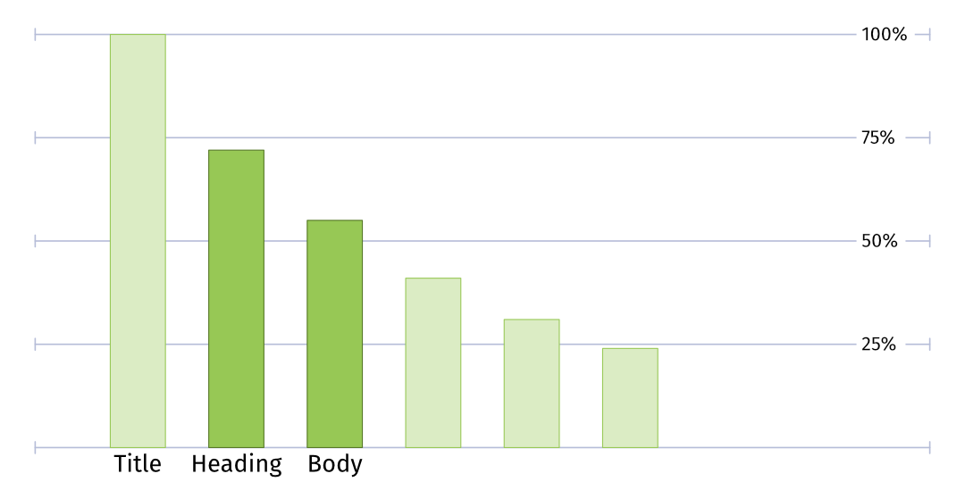
Base
I start with picking the colors that intrigued me most (the yellow and red). Looking at them I realize they are pretty bright and might need some muted or lighter colors to help make them shine. (A poster in only these oranges might scare my audience away).
I start with picking the colors that intrigued me most (the yellow and red). Looking at them I realize they are pretty bright and might need some muted or lighter colors to help make them shine. (A poster in only these oranges might scare my audience away).
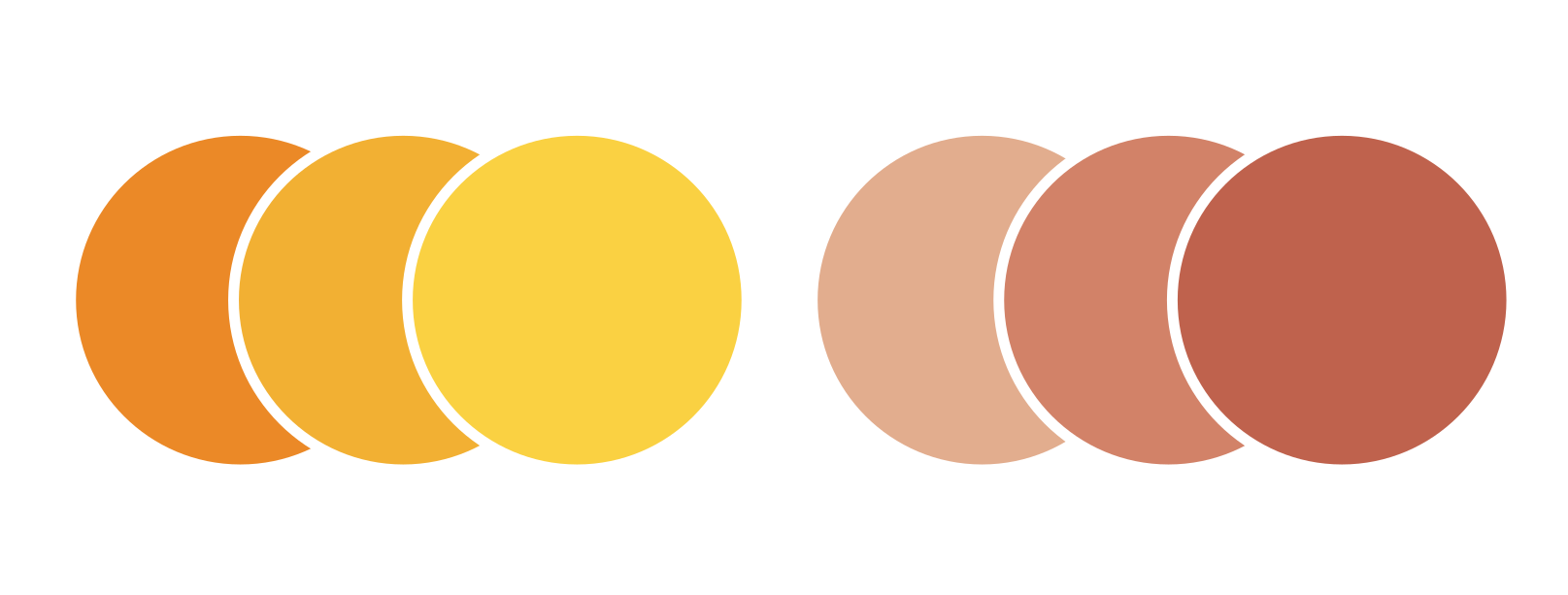
Add neutrals
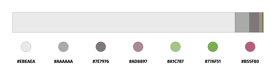
You can try to choose neutral colors that fit yourself, but why not try picking some from the photo? The rock has some soft beiges and some greys that might function well as balancers for my bright colors. So let’s pick a few of them too. I can check later which ones work best through making some quick mock-ups. Here is the palette I decided to work with in the end:
You can try to choose neutral colors that fit yourself, but why not try picking some from the photo? The rock has some soft beiges and some greys that might function well as balancers for my bright colors. So let’s pick a few of them too. I can check later which ones work best through making some quick mock-ups. Here is the palette I decided to work with in the end:
Test
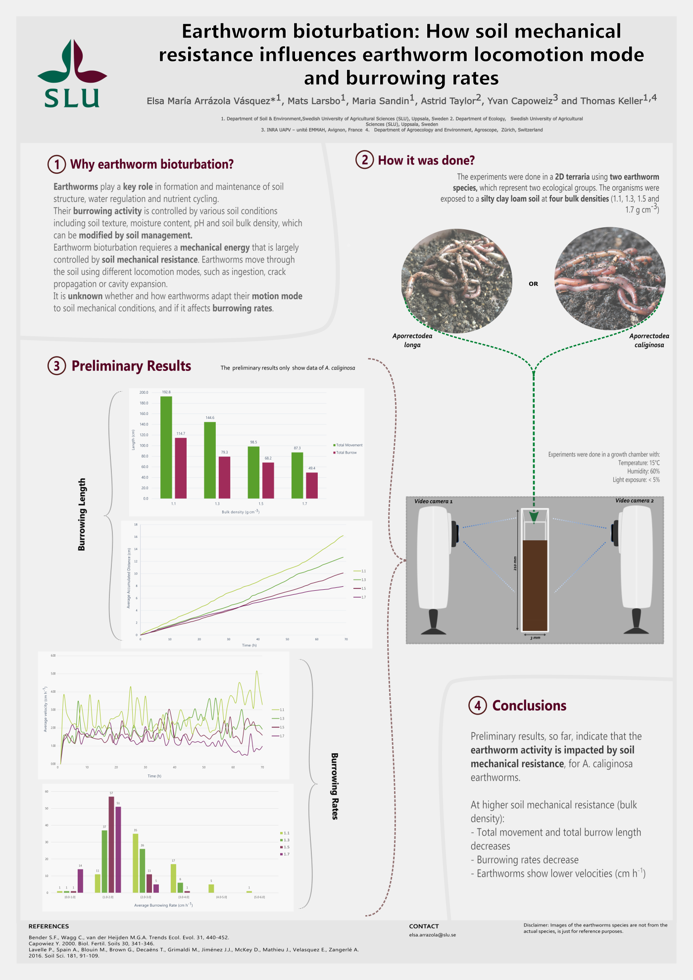
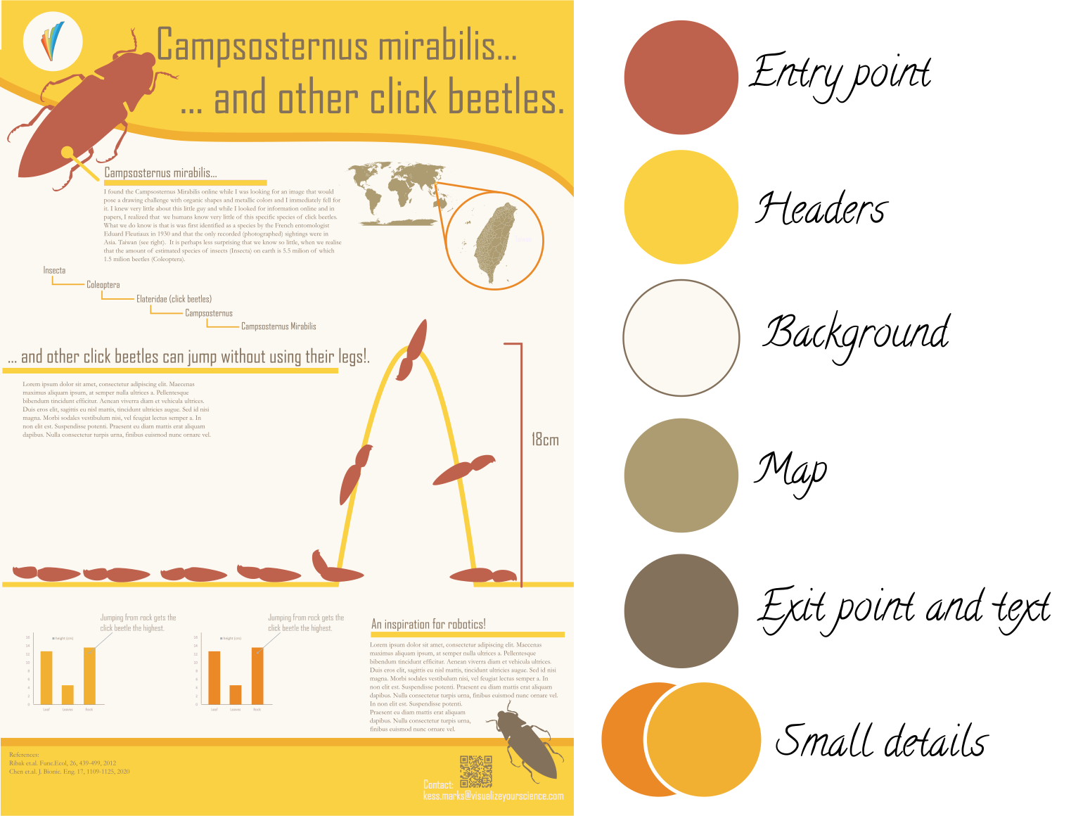
Now just because you love a photo, doesn’t mean its colors will work on a scientific poster. You might need to vary saturation and lightness of you colors to get to a poster that has that vibe or feeling you wanted, while being pleasant to look at a well. While making mock ups, I found the darkest orange in my palette had a much higher visual weight than I thought and was only appropriate for very small areas. This resulted in the test poster below being more yellow than orange, but I am happy with the interactions between the red and the yellow. I feel I have transferred that vibrant sunny feeling that inspired me to photograph the lichen.
Now just because you love a photo, doesn’t mean its colors will work on a scientific poster. You might need to vary saturation and lightness of you colors to get to a poster that has that vibe or feeling you wanted, while being pleasant to look at a well. While making mock ups, I found the darkest orange in my palette had a much higher visual weight than I thought and was only appropriate for very small areas. This resulted in the test poster below being more yellow than orange, but I am happy with the interactions between the red and the yellow. I feel I have transferred that vibrant sunny feeling that inspired me to photograph the lichen.
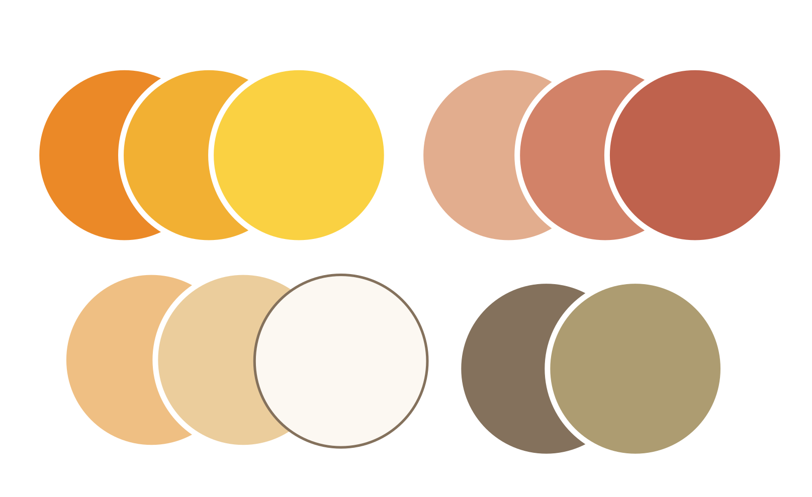
Vary when neccessary
Note also that I ended up not using four of the colors I picked! The two lighter reds and the two darker beiges. This is ok, you don't have to use a color just because you pick it. Sometimes the best decision you can make is to leave a color out.
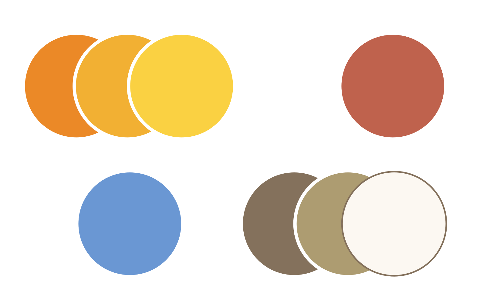
It might also happen that you find yourself in need of a specific color that is not in your selected palette. In this case you are free to simply add it. For example, if I wanted a blue to represent water somewhere on my poster my final palette would look like this .
Note also that I ended up not using four of the colors I picked! The two lighter reds and the two darker beiges. This is ok, you don't have to use a color just because you pick it. Sometimes the best decision you can make is to leave a color out.
It might also happen that you find yourself in need of a specific color that is not in your selected palette. In this case you are free to simply add it. For example, if I wanted a blue to represent water somewhere on my poster my final palette would look like this .
To conclude...
Color picking from a photo is easy and fun and it is a way to channel inspiration in the world around you to your designs. Even if a palette doesn't work for the design you intended it for, perhaps save it in your library for a potential future project?