One journal asks for the figures to be submitted in .eps format, another gives you the option .tiff, .png or .jpeg. The printer of your thesis wants the full document in .pdf format and the webmaster of the university website asks for your graphical abstract in .png or .svg format. Luckily you have prepared your visuals in vector drawing software and can simply export or “save as” the required format. But then…
The exported files look so different! Where did your background go? Why is it so pixelated? Why are the colors strange? Why is the file too big to upload? What causes these issues?
In some cases, the solution might lie in choosing the right export settings. In other cases, certain file formats simply don´t support all features in our visuals. Some formats work better for digital work, and some are optimized for print.
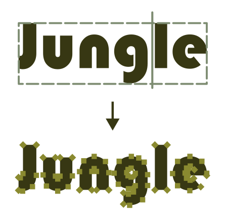
How do you know what export settings or file format to choose? If a journal or printer requires a specific format, what do you need to think of when designing or exporting your visuals? Why are there so many different formats? And how do you make sense of this file format jungle?
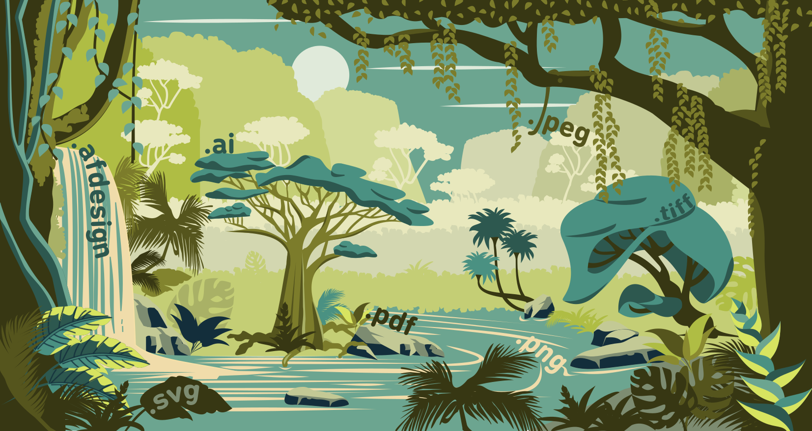
Let us take up the machete and hack a path for you! We will kick-off this blog with a “What´s what” regarding image file formats, discussing pixel and vector graphics, compression, resolution, and other useful things to know about. Then we will examine some concrete issues (with concrete solutions!) that we see recur amongst our students. Finally, we will summarize the common image file formats you will encounter as researchers (.pdf, .png, .jpeg, .tiff, .svg, .ai, .afdesign etc.) , and how to think about using them.
The exported files look so different! Where did your background go? Why is it so pixelated? Why are the colors strange? Why is the file too big to upload? What causes these issues?
In some cases, the solution might lie in choosing the right export settings. In other cases, certain file formats simply don´t support all features in our visuals. Some formats work better for digital work, and some are optimized for print.
How do you know what export settings or file format to choose? If a journal or printer requires a specific format, what do you need to think of when designing or exporting your visuals? Why are there so many different formats? And how do you make sense of this file format jungle?
Let us take up the machete and hack a path for you! We will kick-off this blog with a “What´s what” regarding image file formats, discussing pixel and vector graphics, compression, resolution, and other useful things to know about. Then we will examine some concrete issues (with concrete solutions!) that we see recur amongst our students. Finally, we will summarize the common image file formats you will encounter as researchers (.pdf, .png, .jpeg, .tiff, .svg, .ai, .afdesign etc.) , and how to think about using them.
Hopefully by the end of this blog, we will emerge from the jungle together with some useful nuggets of wisdom in our backpack.
What´s what?
When it comes to image file formats, we should first understand how raster and vector images fundamentally differ in the way they store the image information.
Raster formats use pixels. The images are built up out of a grid (raster) of squares and for each position on the grid information on the characteristics of the square are stored (pixel).
The simplest version of a raster image stores one bit of information per pixel, which means a pixel can be either black or white. Increasing the number of bits per pixel will allow for a wider variety of colors to be defined (color depth). It is common nowadays to work with a color depth of 8 bits per pixel and color channel (ie 8 bits red, 8 bits green, 8 bits blue), but higher color depths exist. A downside is that this increase in number of bits, increases the overall file size.
When a raster image is created it is made with a certain number of pixels per distance unit (often inches). This is the image resolution, and it is a measure of the amount of detail that can be shown and often also considered a measure of “image quality” and is often called dpi (dots per inch). The more pixels we squeeze into one inch (or any distance unit), the more detail we can display. However, once the image exists, the resolution is definite, it cannot be increased, only decreased. The solution is to just squeeze a massive number of pixels into every inch when you export your files, but as you might already have guessed… this increases overall file size dramatically.

We want high quality images, but we also want to be able to store them, send them around and use them without slowing down our website. Different raster file formats employ different methods to encode and process pixel information in a way that limits the total file size, this process is also called compression. For example, instead of describing a line of one green pixel followed by ten red pixels as green, red, red, red etc… We could also describe that as “green followed by 10x red”.
This description takes less hard disk space but still retains all the original information which is why it is called “lossless”. Lossless compression is great if you want to store a lot of high-quality photographs and save yourself some hard disk space. Formats like .tiff and .png employ lossless compression.
Lossy compression, as the name implies, does lead to the irreversible loss of information, but in return much smaller file sizes can be achieved. There exist various algorithms for lossy compression, but the basic idea is that certain less important information is discarded, for example color nuances that are not easy to spot with the human eye anyway. With too much lossy compression, the images can look pixelated, the colors change or artifacts like banding and more patterns are introduced. Lossy compression is particularly useful for online purposes, for example if you want to ensure that the images on your website load fast enough. Formats like .jpeg employ lossy compression.
Vector formats use mathematical equations instead of pixels to define an image. These equations describe all aspects of the image using points in space, lines between those points and the shapes and colors of the lines as well as geometrical shapes etc. This makes it so that vector images can be scaled up without a loss of quality. Theoretically vector images have an infinite resolution.
This also results in a different scaling of file size, which for vector images depends more on the number of different objects and effects that you use to build up your image. All elements in a vector illustration are defined separately, which makes it easy to modify and resize the image, or reuse elements, all while keeping quality the same.
Every time a vector graphics file is opened, the software runs through the equations that define the image, and the image is drawn anew. This can be a source of small deviations when opening vector format files with different software as not all software reads and translates the vector equations exactly the same. Usually these deviations are negligible, but it can´t hurt to double check what your image looks like in it´s final application. For example, if you create a vector image for the web it is good to ensure it is displayed properly in all web browsers.
Scalable vector graphics (.svg) is the standardized file format for vector images, but most vector drawing software have developed their own native formats in order to facilitate the workflow within the software, for example Affinity Designer uses .afdesign and Adobe Illustrator uses .ai. The benefit is that vector drawing software can offer more functionality to their users, the downside is that as a user you can only share your file with someone who also has that specific software.
Therefore, working and saving your images in proprietary format (or .svg) for your own personal process (keeping a working file) and exporting or “saving as” images to different formats when you share your work with others is a common workflow. But this is also where issues can arise.
Common issues

Issue 1: My raster image looks pixelated.
We tend to find it hard to balance the compression level with quality of our raster images when we export. If you are exporting to png, tiff or any other raster format knowing the purpose of the image will help you decide what resolution you need. Web images or images for social media don´t need the same quality as printwork does. They do however need to be small enough to load fast. For web images 72 to 96 dpi is common. For print you would want at least 200 dpi, and some printers might ask for even higher. When you are printing always ask your printer for their requirements, they are the experts after all.
If your raster image looks pixelated, check the export setting you used and increase the resolution if necessary. Remember that any raster image will look pixelated if you zoom in enough.
Raster images can also suffer from generational issues if you are using lossy compression. Multiple cycles of lossy compression will make an image look worse and worse, since more and more original data is discarded.
Sometimes it happens that you have simply set the canvas size in the vector drawing software too small. You can create a beautiful vector image on a 20x20 pixel wide artboard, but when you export it, it will be tiny and if you zoom in it will be pixelated. If this happens to you, simply resize your drawing inside the vector drawing software before you export. You can save yourself some headaches if you set your canvas or document to the right dimensions before you start drawing.
Issue 2: An image I imported into my vector graphics becomes pixelated when scaled up, I thought resolution was infinite?
It is possible to import raster images into a vector file, which can be useful for example if you want to use photos on a poster that you are designing in vector software. However, it is good to realize that those raster images don´t become vector images just by importing them. The vector drawing software incorporates the raster image and pixel information in the file. This means that the same loss of quality will occur when you scale up the image, and you will increase the file size of your vector image significantly.
There are also some filters and other effects within the vector software that are in fact raster effects and those can look pixelated when the entire image is scaled up as well.
Issue 3: PDF does not support vector based blurs.
PDF does not support vector based blurs, so, any shading or subtle transition that you created in your illustration using a blur tool, will suddenly not look so smooth anymore, like in the example below. There are other file formats that don´t support blurs or other effects such as transparencies and/or gradients, but since PDF is such a popular format we see this particular problem a lot.
PDF does not support vector based blurs, so, any shading or subtle transition that you created in your illustration using a blur tool, will suddenly not look so smooth anymore, like in the example below. There are other file formats that don´t support blurs or other effects such as transparencies and/or gradients, but since PDF is such a popular format we see this particular problem a lot.
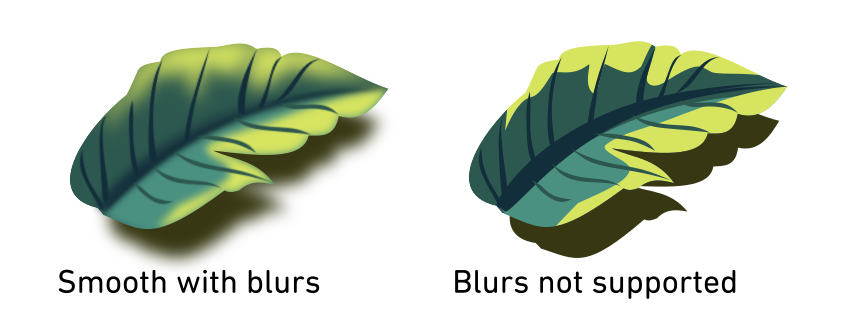
A solution is to choose the export option that rasterizes effects like blurs. This means that upon export the elements with blurs, are turned into raster images instead. This also means that those elements of the graphic no longer have the infinite scalability of a vector graphic nor can they be edited in the same way you use vector graphics. For some software rasterizing any non supported effects is the default setting, for others you have to actively choose it.
Issue 4: Text looks different (not the same typeface).
If you open a vector format file that includes text on a different computer then the one it was made on, the text might look different if that computer does not have access to the same typeface. In this case most likely the original typeface is replaced by a default typeface which can dramatically affect the look of your graphical work.
One solution is to choose the “embed font” option when exporting, this includes the font information inside the file so it will travel wherever the file goes. The downside is that besides increasing file size, you might be unknowingly (or now that you´ve read this knowingly) distributing copyrighted fonts.
A better solution might be to turn your text into vector objects before exporting and sharing your file. This is done using “Text to path” in Inkscape, “Create outline” in Adobe illustrator or “Convert to curves” in Affinity. One should keep in mind that in most cases this is an irreversible step so if you know you might want to edit the text in future, make sure you keep a version of your file where the text remains text.
Issue 5: My colors look different after exporting.
Remember that for digital media, colors will always look slightly different depending on what screen they will be displayed on. So, worrying about tiny deviations might not be worth your time. For printing there will always be a discrepancy between how you see the colors on screen and how they will look printed. It is always recommended to ask the printer for test prints when it comes to color.
Colors can turn out different for a number of reasons.
The first one is the color space. In most cases you will be working in either the CMYK or the RGB color space. These color spaces don’t exactly overlap and some colors that exist in one color space don't exist in the other. If you happen to have worked with a color, that only exists in one color space, but you are trying to export to a file that only supports the other, your color can't be represented. In that case the exporting function might approximate the color you used to its nearest neighbor. Usually, these changes are small and you won't really notice them, but occasionally the “nearest neighbor” is too different. In that case you might want to evaluate if you really need to export to a format with a different color space, or you might want to adjust your design.

Another cause of colors looking different might be the color depth. If you designed your image in a document with 16 bit color depth, but are exporting to a file with only 8 bit color depth, it can be that not all colors you used can be represented. This is often most obvious if you have gradients in your image. For gradients to appear smooth, you need a lot of different colors that subtly transition in each other. If a gradient is suddenly represented with a lower color depth a phenomenon called banding will occur. Your gradient will no longer look smooth but appear as bands of different colors. If you observe banding in your exports, double check the color depth setting of your export.
Finally, it can also be that you are applying too much lossy compression to your image and color information is getting lost. This can occur either if you are compressing a lot at once to get a really small file size or with repeated lossy compression of the same image. Consider whether you really need such extreme compression, and if you do, whether your design is perhaps too complicated for the purpose you intend to use it for.
It is always advised to set the color space and color depth of the document you are working in before you start illustrating, if possible.
Image file formats
The list below describes the most common file formats, their benefits, downsides and general purpose, to help you either understand why a specific format is not working for you or help you decide what format is best for your purpose.

TIFF
This is a lossless raster image file type. It is used often by photographers and printers. The main purpose of this file type is retaining the high quality of the images, hence the files are in general larger. TIFF has a very large color depth (1-32 bits) which makes it particularly suitable for photos and digital art. However, tiff files are usually too large for web browsers.
This is a lossless raster image file type. It is used often by photographers and printers. The main purpose of this file type is retaining the high quality of the images, hence the files are in general larger. TIFF has a very large color depth (1-32 bits) which makes it particularly suitable for photos and digital art. However, tiff files are usually too large for web browsers.
JPEG
This is the most common lossy raster image file type. Its main purpose is to create small file formats, which is good for web graphics, but often not so good for print work. The biggest issue you might have when exporting to JPEG is that it does not support transparencies. This might affect any transparent background or shading you might have done in a detailed drawing.
This is the most common lossy raster image file type. Its main purpose is to create small file formats, which is good for web graphics, but often not so good for print work. The biggest issue you might have when exporting to JPEG is that it does not support transparencies. This might affect any transparent background or shading you might have done in a detailed drawing.
PNG
This is a lossless raster image file type. Its main purpose is the distribution of good quality images online. PNG does not support the CMYK color space which means it’s not a favourite among printers. It does have a rather large color depth 1-16 bits and can handle transparencies.
This is a lossless raster image file type. Its main purpose is the distribution of good quality images online. PNG does not support the CMYK color space which means it’s not a favourite among printers. It does have a rather large color depth 1-16 bits and can handle transparencies.
SVG
As mentioned before SVG is considered the standard for vector graphics. Like other vector graphics formats, the way the image is displayed can be slightly different in different software. It does not support the CMYK color space. Inkscape svg differs from normal svg only in the fact that there are additional command lines that can be interpreted by the Inkscape software but would be skipped by other software.
As mentioned before SVG is considered the standard for vector graphics. Like other vector graphics formats, the way the image is displayed can be slightly different in different software. It does not support the CMYK color space. Inkscape svg differs from normal svg only in the fact that there are additional command lines that can be interpreted by the Inkscape software but would be skipped by other software.
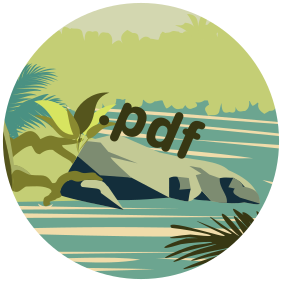
PDF
PDF stands for “portable document format” which reveals its main focus: to easily share files independent of software, hardware and operating systems. Because of this universality printers will often ask for a PDF file. PDF documents can contain both raster, vector, and text information.
PDF graphics can be difficult to edit after creation and certain vector graphic effects, like blurs will be rasterized upon export to PDF. This limits the editability of the vector part of PDFs, hence PDF should be considered the final destination of your work (for example if your printer requires pdf) but is not suitable as a working file.
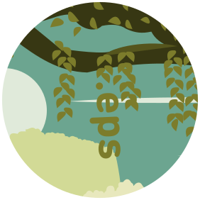
EPS
Encapsulated postscript (EPS) is an older file format that is used among printers and therefore journals, which is why we touch upon it here. Like PDF they can contain raster, vector and text information but EPS does not support transparencies.
Encapsulated postscript (EPS) is an older file format that is used among printers and therefore journals, which is why we touch upon it here. Like PDF they can contain raster, vector and text information but EPS does not support transparencies.
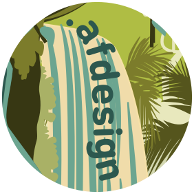
AFDESIGN
AFDESIGN is a vector graphic file format that can only be opened and edited by affinity software. It is therefore most useful as a “working file” for those that use Affinity Designer for their creations. In order to share the file, use your creation online or in printing, exporting is most likely necessary.
AFDESIGN is a vector graphic file format that can only be opened and edited by affinity software. It is therefore most useful as a “working file” for those that use Affinity Designer for their creations. In order to share the file, use your creation online or in printing, exporting is most likely necessary.

AI
AI is a vector graphic file format that can only be opened and edited by Adobe Illustrator software. It is therefore most useful as a “working file” for those that use Adobe Illustrator for their creations. In order to share the file, use your creation online or in printing, exporting is most likely necessary.
AI is a vector graphic file format that can only be opened and edited by Adobe Illustrator software. It is therefore most useful as a “working file” for those that use Adobe Illustrator for their creations. In order to share the file, use your creation online or in printing, exporting is most likely necessary.