As researchers, we have all come across templates of some form. If you want to read more about why we think you should stick to your own design and only use templates when it’s unavoidable, read the first part of the series here. In this second part, we will discuss practical tips on how to work with poster templates from your university if you are in a situation where you must use them. Sometimes you don't have much of a choice, but you can still make a great poster!
The logo
The only thing you need to know about university logos is: do not mess with it! This means that you should never edit or change the logo in any way. The logo is one of the most important visuals used for branding of the university, and it should always be treated with respect. Maybe somewhere, there is a university we have not yet heard of that wants you to change its logo. In that case, you are of course free to treat it however you’d like (and please let us know about this university!). In most cases, however, you can choose between a logo that goes on a dark or a bright background, and a version with English text and one with whatever other language might be relevant. Some universities also have rules for how the logo is to be used on a poster, so remember to scan your university website for this information.
The poster template
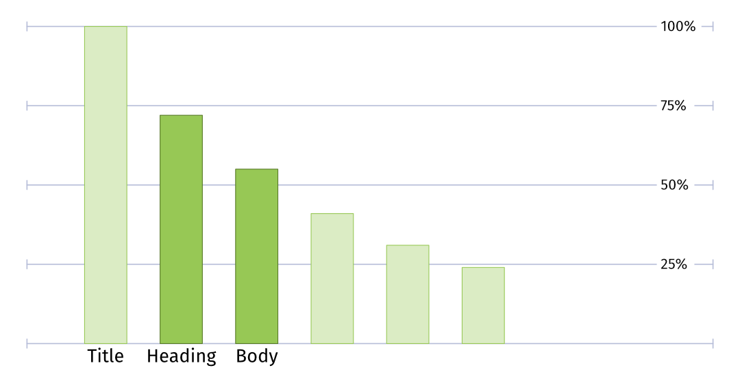
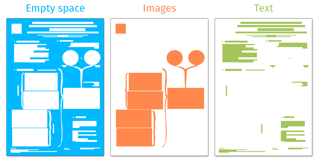
A good poster needs a clear entry point or something that stands out, to attract people during a poster session. The second thing to make a good poster is to create a structure that is easy to follow, so that people can find the relevant information on it. Finally, a good poster needs lots of empty space, so that it is pleasant to read and to look at.
At a conference poster session, we usually don’t have time to read all the posters, so you must make it as easy as possible for people to find, understand, and read your poster. If you simply dump information on people and don’t think about how it’s being communicated, your research will not get the attention it deserves.
Template posters typically have a rigid structure pointing out where the information is, but they are not adapted to be easily followed or to the overall scientific message you want to communicate. Therefore, what you need to work with, if you are using a template poster, is to make sure there is a good entry point to the poster and make it pleasant to read.
Let’s have a look at a few examples of issues with templates and some tips on how to deal with them!
Issue 1: The template is in the wrong format or size
If you want to use a template but it is provided in a format that doesn’t work for you, you can try to re-create the template in the size or software of your choice. Make sure you get the colors and logo right. You can often find logos to download from the university website, as well as hex codes for the official colors to use. Many conferences have a size requirement for the poster, and it’s important to follow it so that your poster will fit the designated space during the poster session.
If the template provided by the university is a different size, you might be tempted to just rescale the template to fit your desired size. This can lead to skewed objects and text, and a structure that is confusing. Be careful when trying to resize content and keep aspect ratios locked for text and images. It’s good to keep in mind that a reading order that works for a poster in landscape format might not translate well to a poster in portrait format.
If the template provided by the university is a different size, you might be tempted to just rescale the template to fit your desired size. This can lead to skewed objects and text, and a structure that is confusing. Be careful when trying to resize content and keep aspect ratios locked for text and images. It’s good to keep in mind that a reading order that works for a poster in landscape format might not translate well to a poster in portrait format.
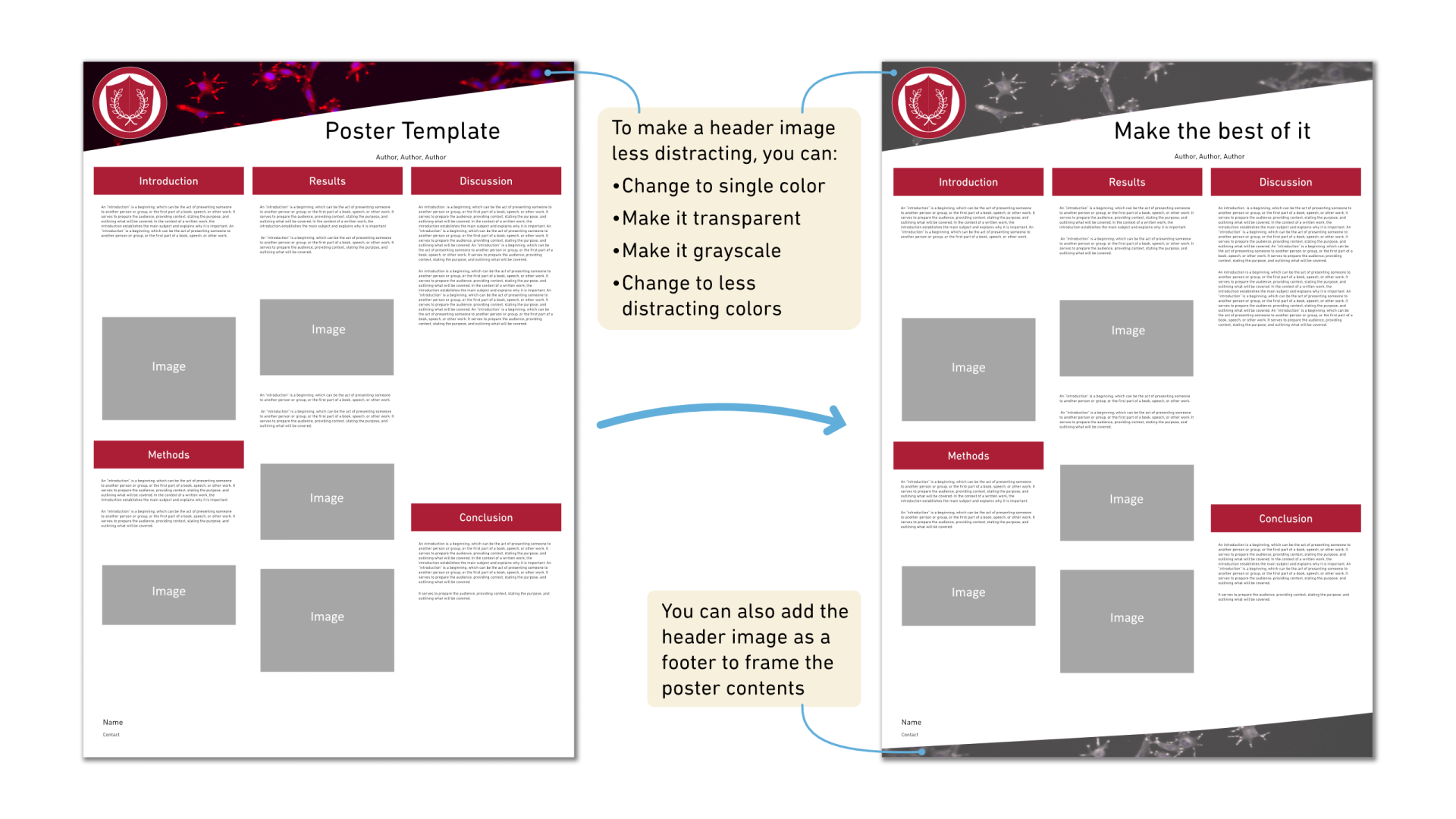
Issue 2: The template has a distracting photo or image as a header
Some universities have poster templates that have an interesting-looking photo or a striking 3D image as the background of the header or the footer for the poster. This is probably put there to make the poster look interesting and stand out compared to other posters. While it might be effective in that, it does not do anything more than just stand out. It might even distract readers from the content of your poster, which is far more important than an image that is simply there to draw attention or to unify a poster in the style of your university.
One way to deal with it is to modify it to a single color matching the overall color palette of the poster. If you have no choice and have to use the header with the photo, you can reduce the intensity of the image by making it more transparent or inverting the colors to a less distracting color (such as black and white), and therefore reduce the distraction from other visuals on your poster. If the distracting image is only on the header, you can also reuse it as a footer to guide the focus back to the center of the poster, where the actual interesting part is shown: your research!
One way to deal with it is to modify it to a single color matching the overall color palette of the poster. If you have no choice and have to use the header with the photo, you can reduce the intensity of the image by making it more transparent or inverting the colors to a less distracting color (such as black and white), and therefore reduce the distraction from other visuals on your poster. If the distracting image is only on the header, you can also reuse it as a footer to guide the focus back to the center of the poster, where the actual interesting part is shown: your research!
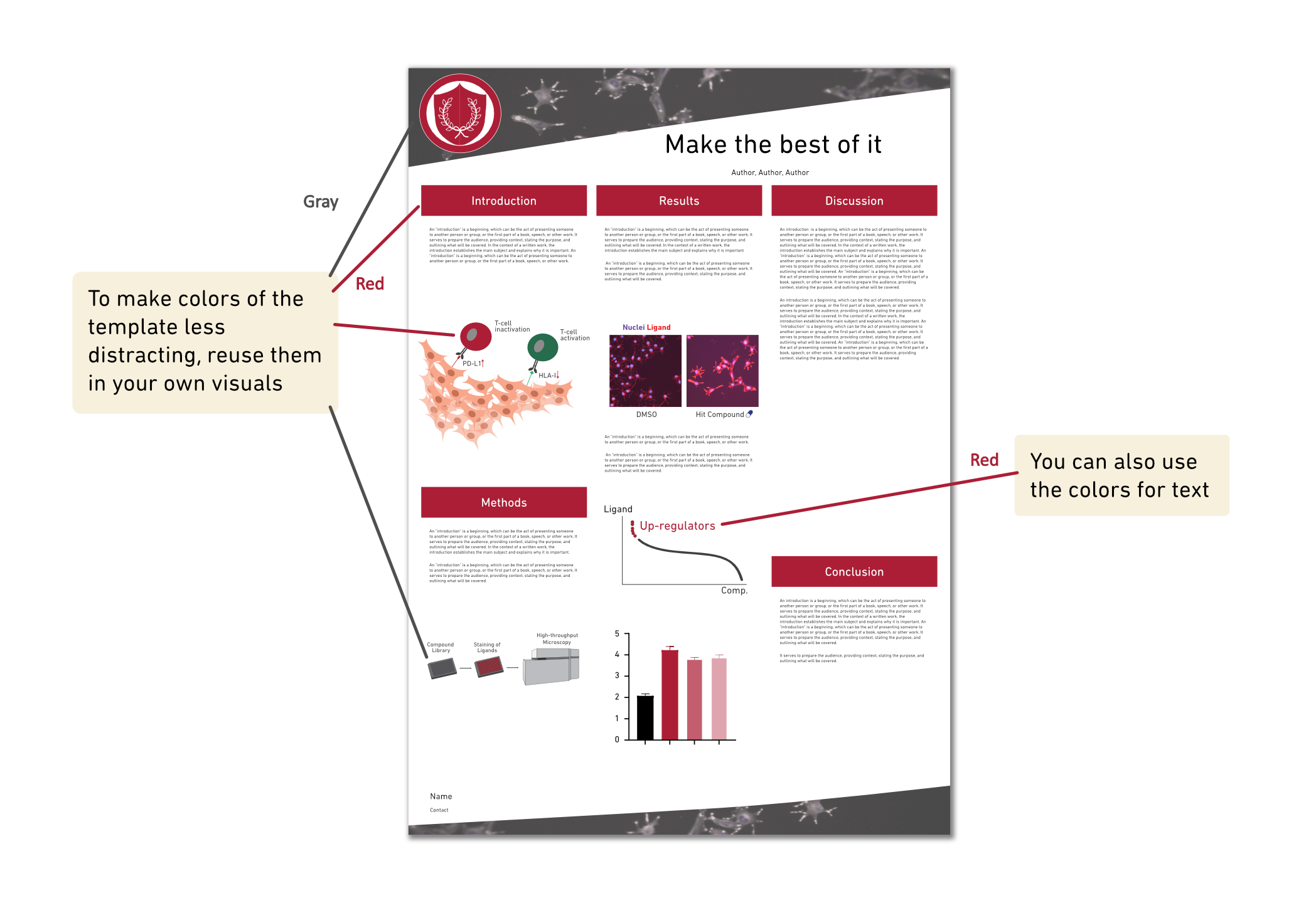
Issue 3: The template has very interesting colors
If the template uses a header and footer with very strong colors, it can be hard for the contents of your poster to stand out. This is because strong colors are visually quite heavy. There are ways to work with that, and one way is to use the strong color in your own visuals of the poster. You could implement the same color in your entry point, data visualizations, or other visuals. You could also create headings or parts of the text in the same color. This will unify the style of the poster and balance the visual impact so that the strongly colored header and footer do not stand out so much.
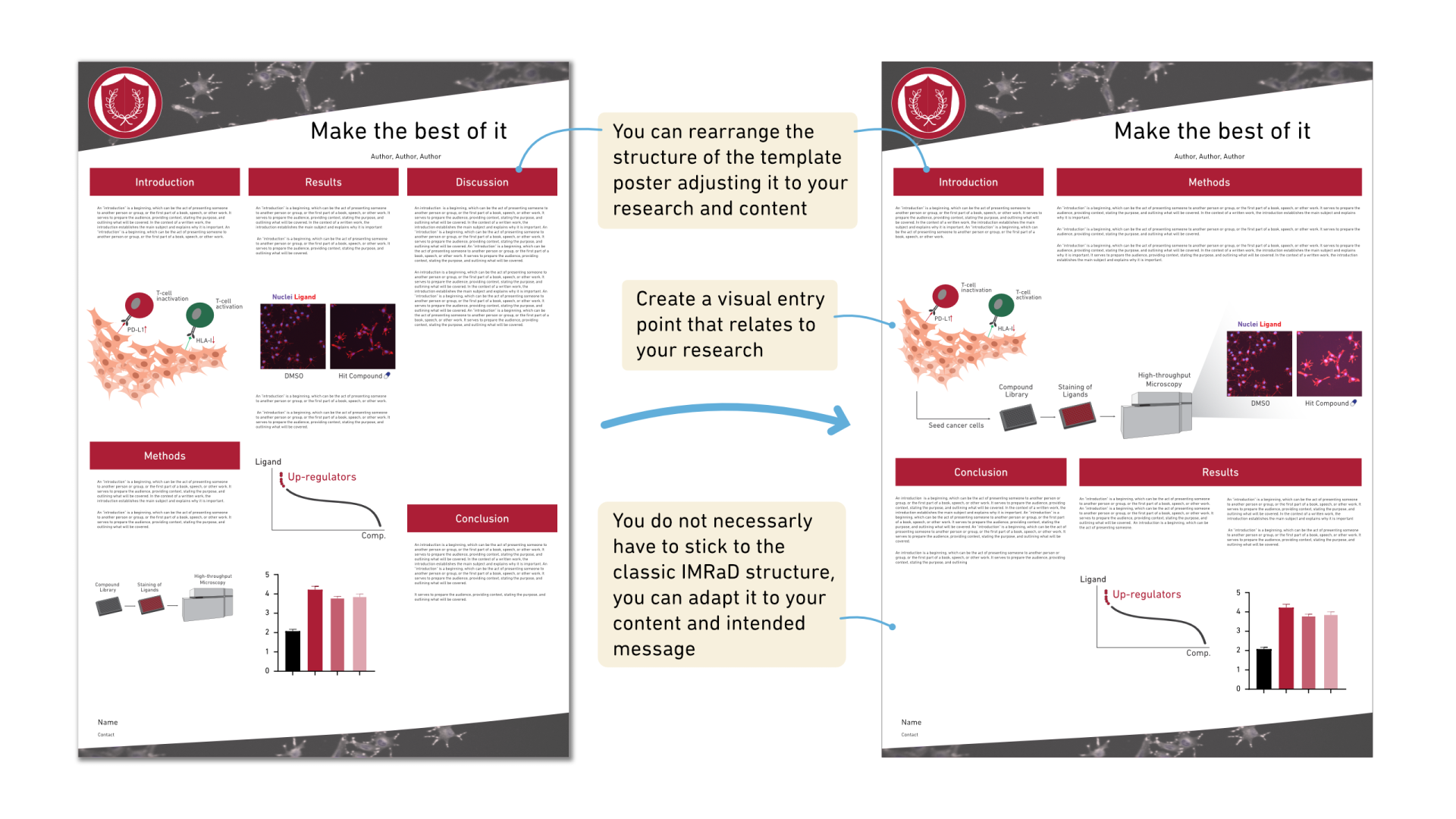
Issue 4: The template has a structure and entry point that doesn’t work for you
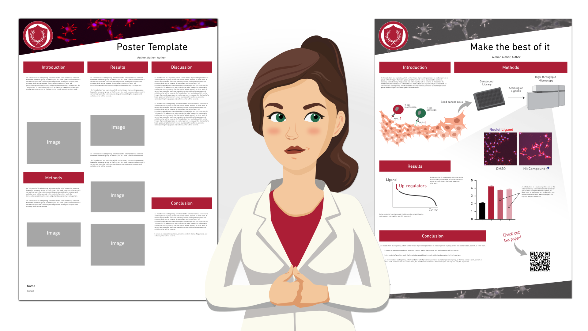
If the template enforces a classic structure like the IMRaD (Introduction, Methods, Results, and Discussion) structure, you might feel forced to present your research in that way. There are many other structures that you could follow, and it’s important to adapt the structure to your content and to the message that you have. Perhaps your poster is only describing your experimental methods or a specific part of a project that does not yet have results. Or maybe your poster will be shown to an audience that needs no classic introduction to the topic. No matter what, you should always adapt the structure to your content and intended story, even when using a template.
In addition, we strongly recommend that your poster stand out using a good entry point that is related to your research and good graphic design instead. The entry point can be an important result graph, an illustration that shows your experimental method, or anything that relates to your research. A good entry point will attract readers to your poster, inform them what the poster is about, and help explain your research or your results.
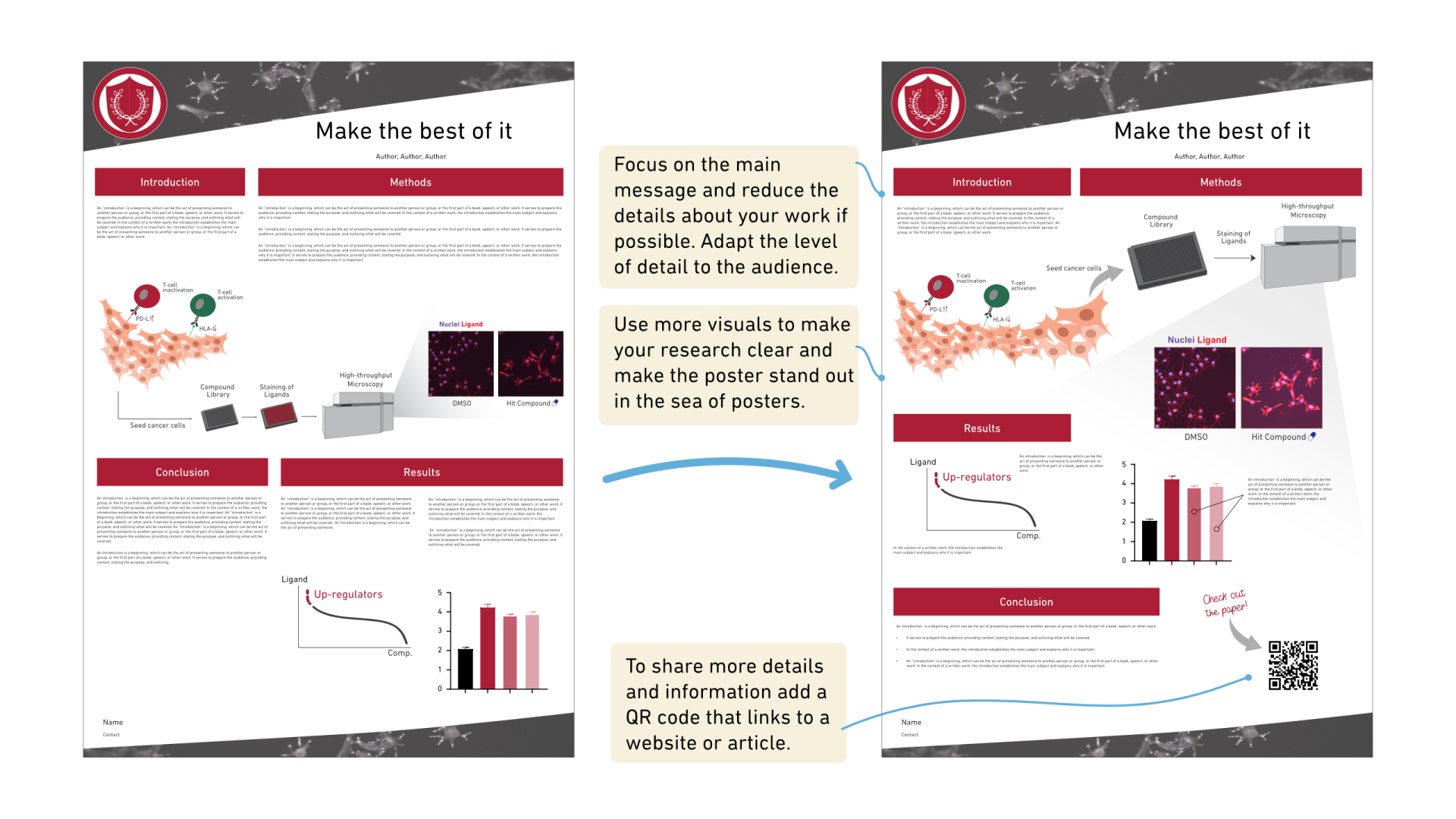
Issue 5: The template looks more like an article and less like a poster
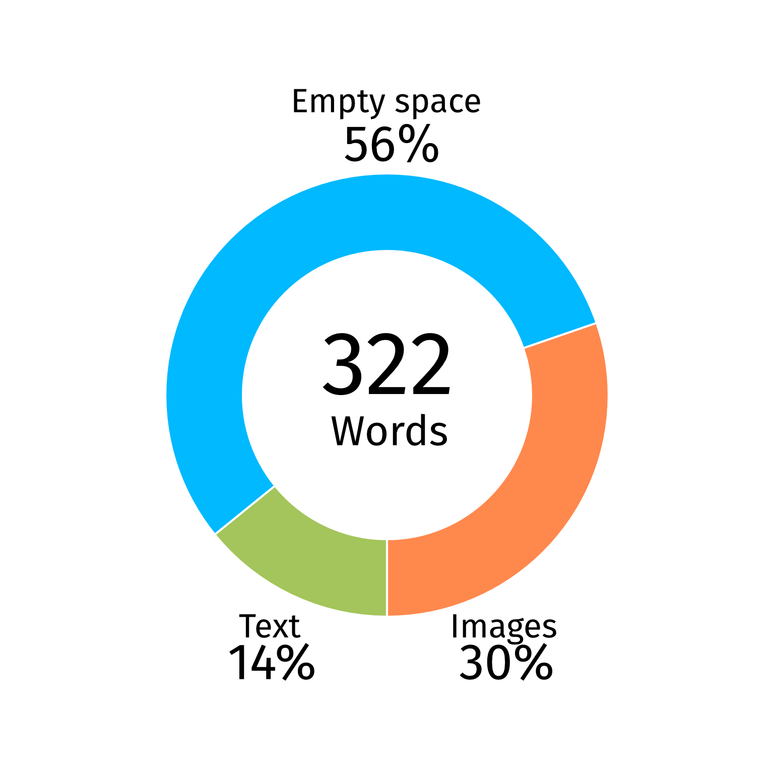
The amount of time and effort you can spend reading and understanding an article is not available to a reader of a conference poster during a poster session or while walking by it in a corridor. If the template is just two columns with text, it’s not a poster but an article printed in a larger format (there are, of course, ways you can still make a good poster with a lot of text, but that is a topic for another blog post). Such a poster will only be read by a few, and you could potentially miss out on the opportunity to connect with new collaborators and get a new perspective on your research. Therefore, the formats between the article and poster need to be drastically different.
You will never be able to fit the same level of detail as you can in an article; therefore, focus on the main message you want to communicate by using more visuals and including fewer details on a poster. You can find more tips on how to declutter your poster in our blog post on the topic. You can also make more information about your research accessible by referring to the corresponding journal article, if already published, for example, by adding a QR code to your poster guiding to it. Then, interested people can read more about your work.
You will never be able to fit the same level of detail as you can in an article; therefore, focus on the main message you want to communicate by using more visuals and including fewer details on a poster. You can find more tips on how to declutter your poster in our blog post on the topic. You can also make more information about your research accessible by referring to the corresponding journal article, if already published, for example, by adding a QR code to your poster guiding to it. Then, interested people can read more about your work.
Summary
In this second part of our series on university poster templates, we share practical strategies for making the most of a template when you have no choice but to use it. From respecting the university logo and adapting formats to handling distracting visuals, strong colors, or rigid structures, we highlight how to refine a template so your research remains clear, engaging, and easy to follow. By focusing on strong entry points, thoughtful design, and visual balance, you can transform even the most restrictive template into a poster that attracts attention and communicates your message effectively.