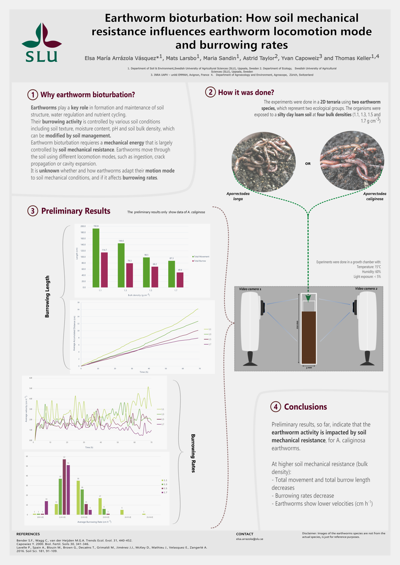
The use of arrows in student-made graphical abstracts
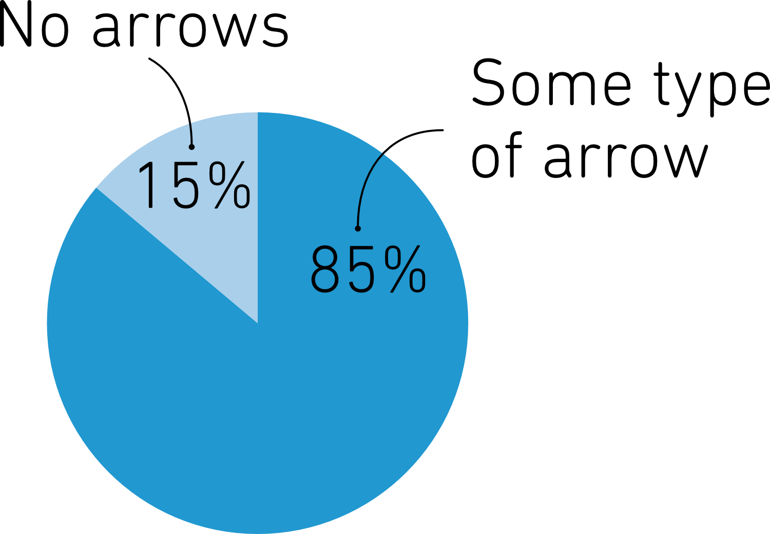
Scientific illustrations are filled with arrows. In a recent batch of over 600 graphical abstracts from the Visualize Your Science course, 85% included arrows in some form. Arrows help tell stories, show processes, and guide the viewer through data. But while arrows are useful, they’re not always the best choice. The use of a lot of different arrows can be confusing and distracting, and sometimes a line or another symbol communicates more clearly.
So, let’s take a closer look at how to use this popular visual element. We will start from the beginning by discussing what arrows are.
So, let’s take a closer look at how to use this popular visual element. We will start from the beginning by discussing what arrows are.
What is an arrow?
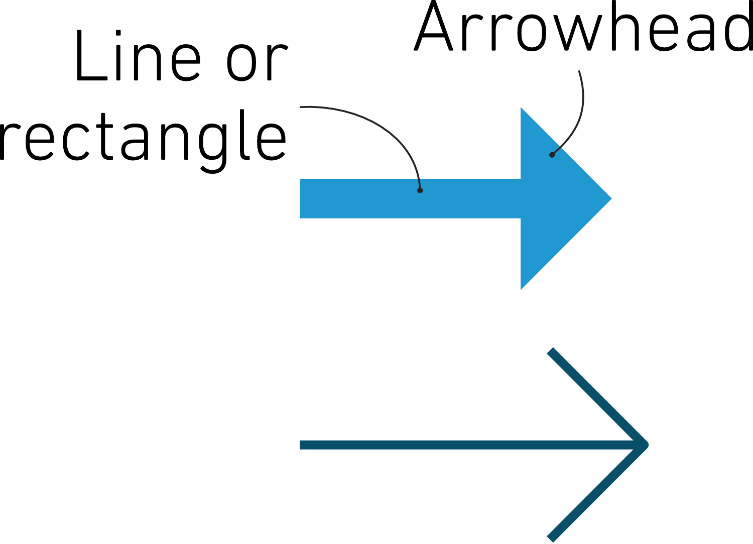
An arrow in its simplest form consists of an arrowhead, usually in the form of a triangle or a line bent at 45 degrees, and a line or a rectangle attached to it. Arrows can, of course, come in various shapes and styles, all depending on the style of the image in which they are used and what purpose they serve.
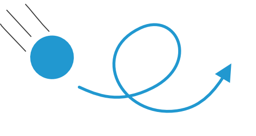
In some designs, only the arrowhead is used, like in this graphical abstract made by our student Natalie Grasser.
In some designs, only the arrowhead is used, like in this graphical abstract made by our student Natalie Grasser.

The visual impact of arrows
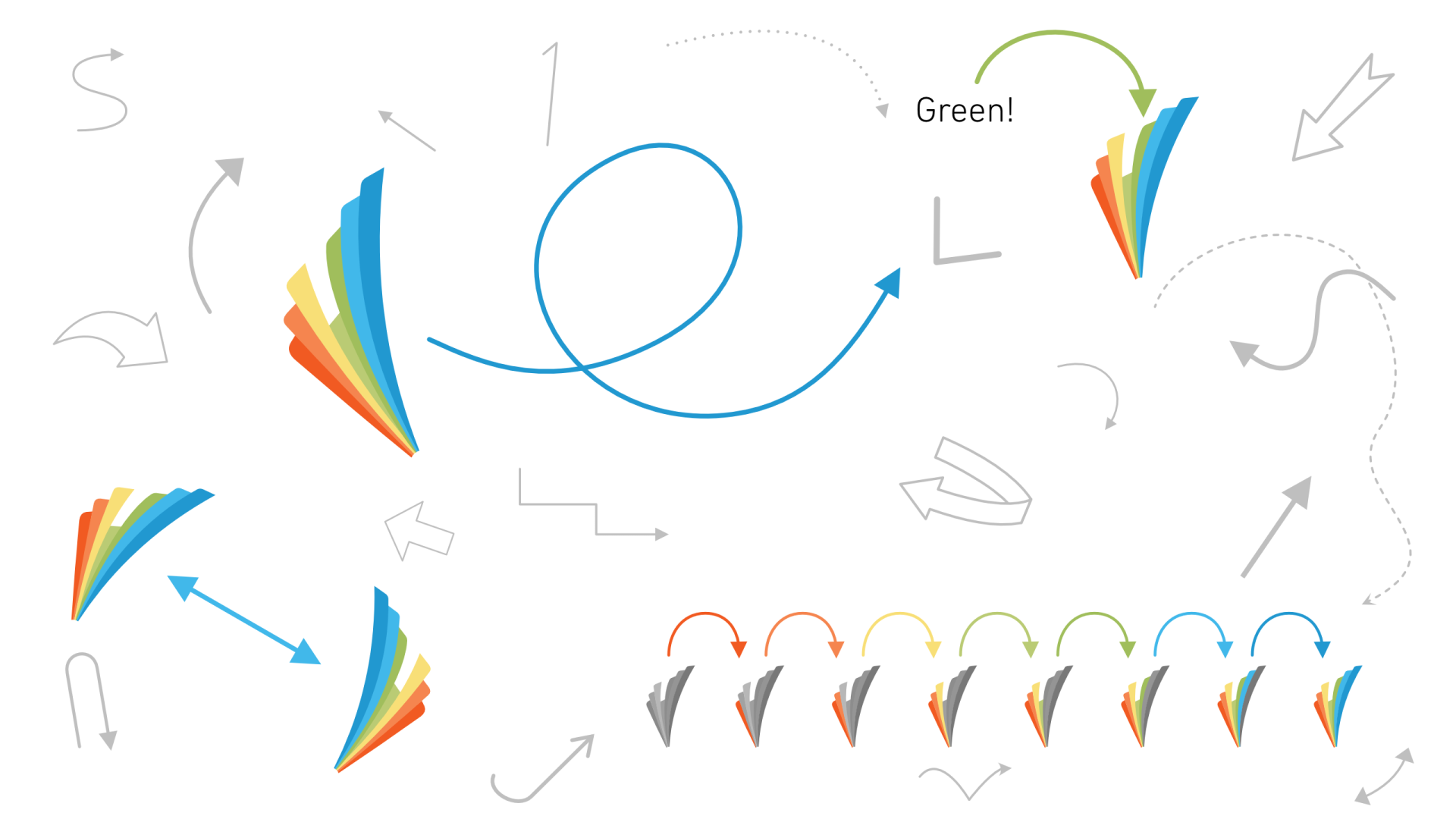
Arrows significantly influence perception and cognition by directing attention and creating visual hierarchy. They help viewers navigate information and understand relationships between different elements. Arrows are strong attention grabbers due to their ability to stand out visually and guide the viewer's eye. They create a sense of urgency and direction, making them effective in highlighting important information. While well-placed arrows can enhance the effectiveness of visual communication, they can also distract, and if there are too many of them in the same image, confuse the viewer. You have probably seen images like this one before:

Based on our (perhaps not-so-scientifically correct) office experiment, it turns out that the arrows mislead most people and instinctively make you head to the left corner first, rather than the right corner, as the text suggests. This is a good reminder that arrows tend to dominate the visual hierarchy, often overriding other cues. That’s why it’s crucial to use them sparingly, deliberately, and with care.
Arrows in visual communication
Arrows are versatile tools in graphic design, used to guide attention, show direction, and clarify relationships. Their meaning depends heavily on context, but their impact is consistent; they help viewers make sense of complex visuals.
Listed below are the main roles arrows play in visual communication:
1. Direction and movement

2. Relationships and connections

3. Guidance and emphasis
4. Sequencing and order

5. Symbolism and meaning
6. Navigation and interaction

7. Spatial orientation
Examples of how to use arrows in your science images
Now that we know what roles arrows can play in visual communication, it's time to look at some examples of how they are used in scientific images.
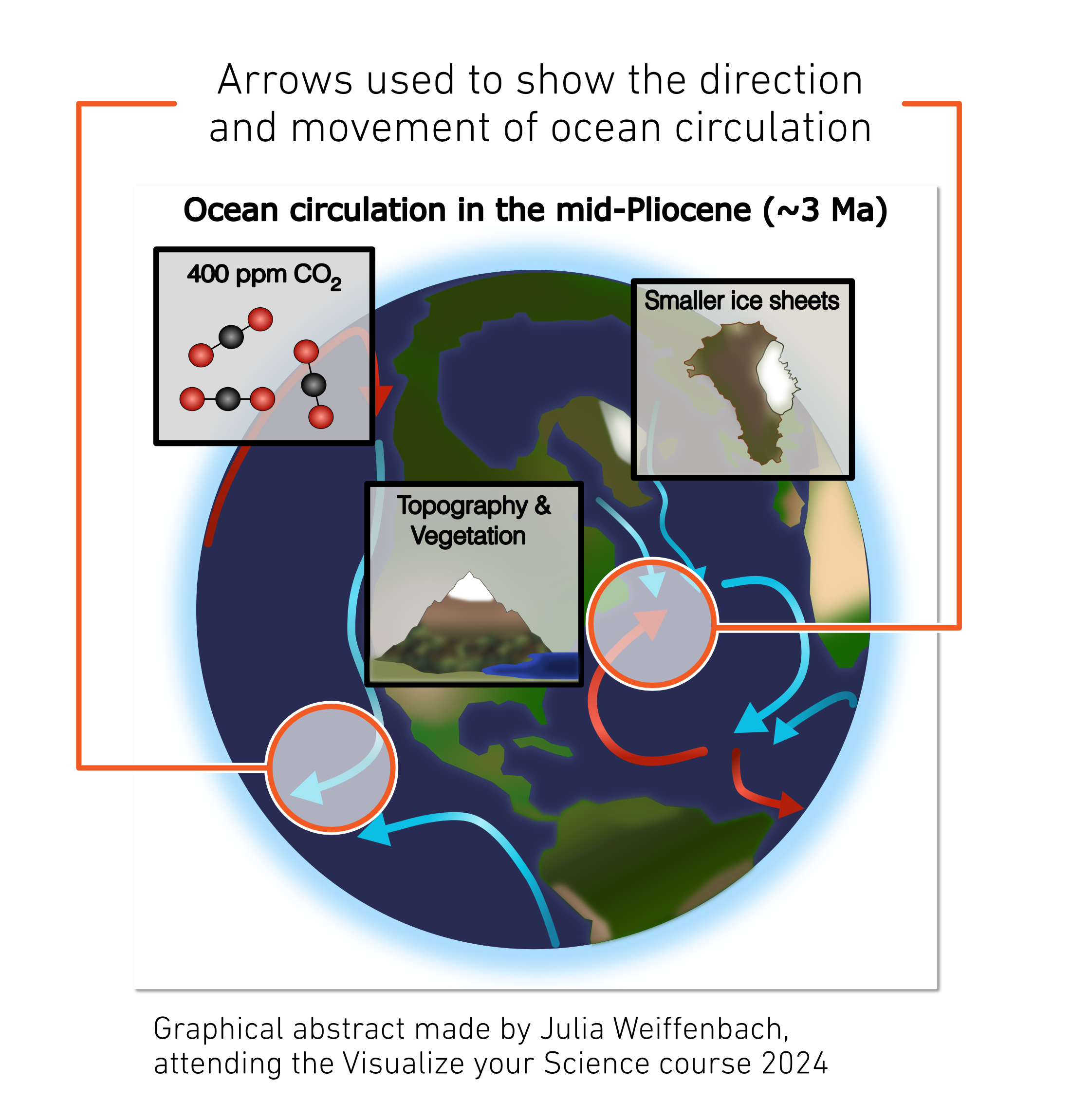
Arrows are effective in showing movement or direction in diagrams and images. This visual cue helps viewers understand dynamic processes. Keep in mind how you draw the arrows to correctly represent the movement you want to show and make sure the arrowhead points in the correct direction. If you show movement of an object, start the line from the center of the object and point the arrowhead to the center of the final position.
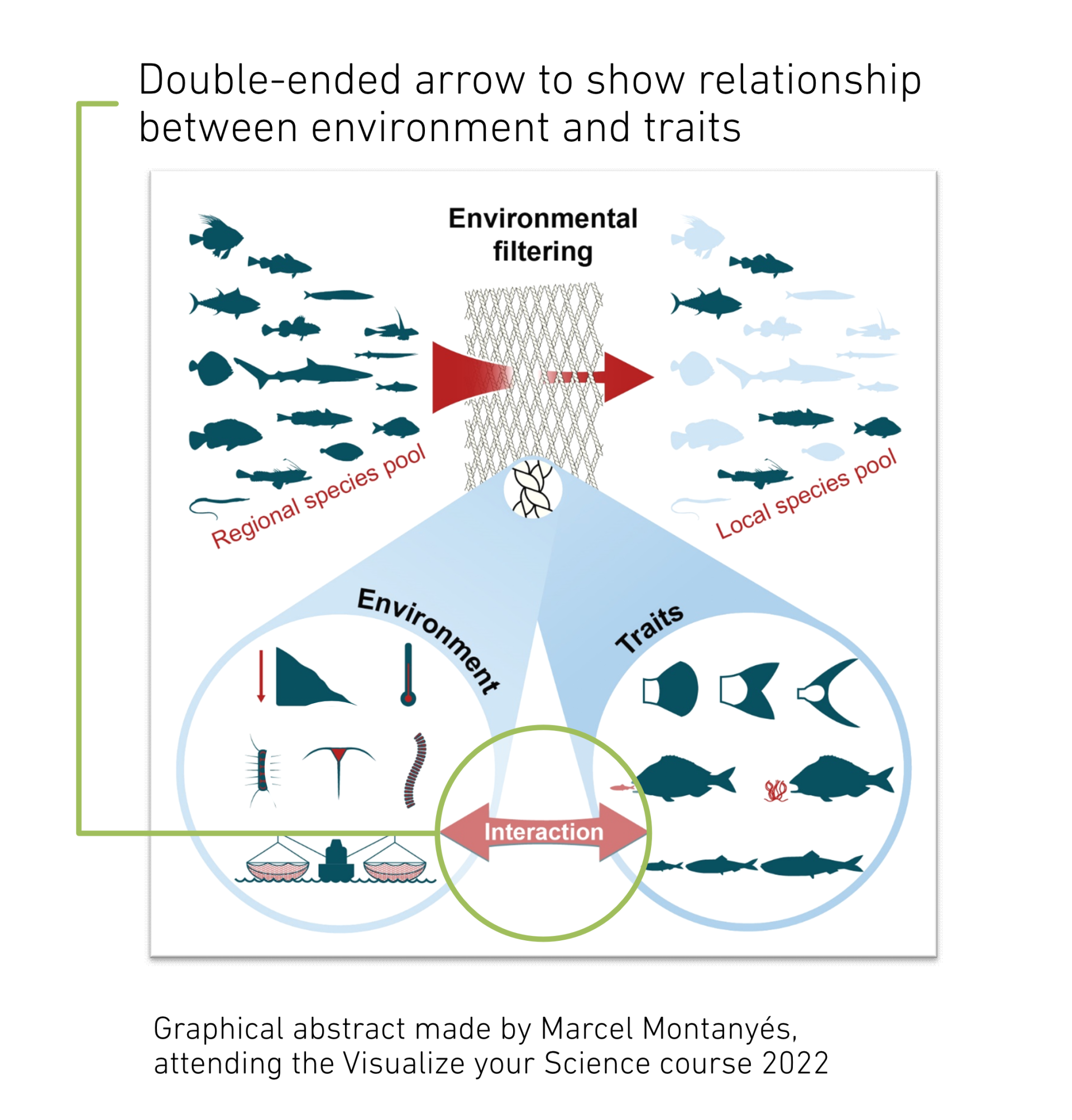
Arrows can be used to show relationships between elements in a diagram. This helps viewers understand how different components interact. You can also indicate that there is no relationship or interaction by blocking an arrow or crossing it out.

Arrows are useful for guiding viewers through a sequence of steps in a process. This ensures that viewers understand the order of operations. Alternatives to arrows are numbering or labelling of the steps, or arrows can be used in combination with either of the two.

Arrows are vital in data visualization, helping to show trends, relationships, and highlight key data points. For example, arrows can be used in line graphs to indicate upward or downward trends. This makes complex data more understandable and engaging. Arrows can also be used to show a simplified version of the results, simply showing if something is increasing or decreasing. This is often done in graphical abstracts, where the details of the increase or decrease are disclosed in the article.
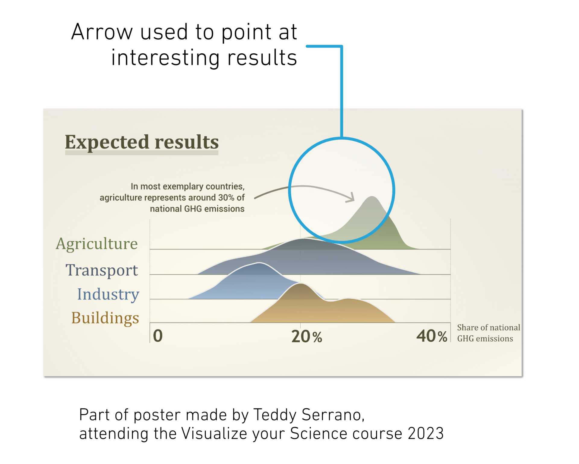
Arrows can be used for pointing out specific areas of interest in scientific images. This helps viewers focus on the most important parts of the image. It is worth noting, however, that other visual elements are just as good to use as an arrow. Perhaps a certain region of the image needs highlighting, and then you can consider a colored shape or box instead. A simple line or a line with a dot could also work instead of an arrow. This is particularly relevant if the visual context contains other arrows to indicate flow or movement; you should avoid using arrows with different meanings in the same context.
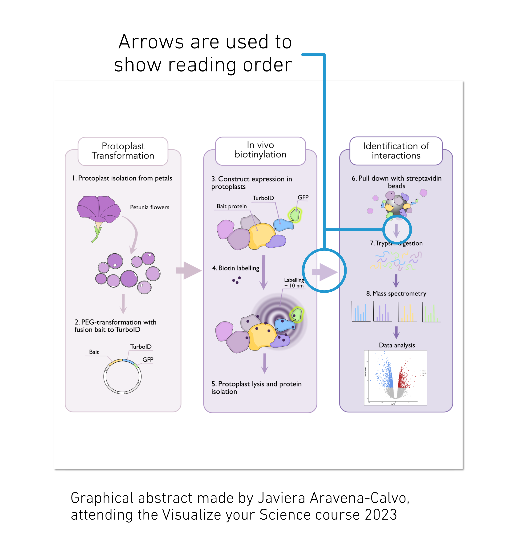
In flow charts and process-type images, arrows are the natural way of showing that the viewer should move on to the next step. If arrows can be used clearly and not take over too much attention from the other visuals, one can be happy about using them to show flow and reading order. One can consider using other principles where arrows clutter the image or distract too much from the other visuals. Numbering of steps, using size or hierarchy to indicate reading order, or using simple lines to guide the viewer are some other options to consider.
Common arrow pitfalls
1. Overloading with arrows: Using too many, too big, or too visually distracting arrows can lead to visual clutter and confusion.
When arrows are overused, the viewer can’t make sense of the visual, and the
arrows lose their purpose. It's essential to use arrows only when necessary.
2. Misleading or ambiguous arrows: Arrows should be clear and unambiguous. Using arrows that are too
small, too large, or placed confusingly can mislead viewers. Ensure that arrows
are appropriately sized, pointing to and from things correctly, and positioned to convey the intended message.
3. Redundant arrows: Avoid using arrows when other visual elements can convey the same
information more effectively. Sometimes, labels, colors, or shapes can be more
appropriate than arrows. Consider alternative visual cues to avoid redundancy. E.g., arrows on chart axes are not always necessary and can sometimes be omitted
without hindering understanding. The primary purpose of axis lines is to define
the coordinate system and provide a visual reference for data points. In many
cases, the presence of axis lines alone is sufficient for readers to understand
the scale and direction of the graph.
4. Arrows with multiple meanings: If your image contains multiple arrows with
varying meanings, it can become confusing, distracting, and overly complex to
follow. Consider using arrows only for one meaning and other design elements
for other meanings. One example is in an image depicting an experimental setup
where arrows are used to show movement, flow, and label the different parts of
the setup. Better would be to, for example, use the arrows to depict the flow, use
lines or blurs, represent the movement, and use simple lines to label the parts
of the setup.
Conclusion
We hope you feel more confident in how to use arrows appropriately in your science visuals! Stay tuned for the next part in the Arrows series, where we will get practical and talk about how to draw arrows and show a lot more examples. In the meantime, good luck with your images, and we hope that you feel more confident using arrows in your science visuals in the future.