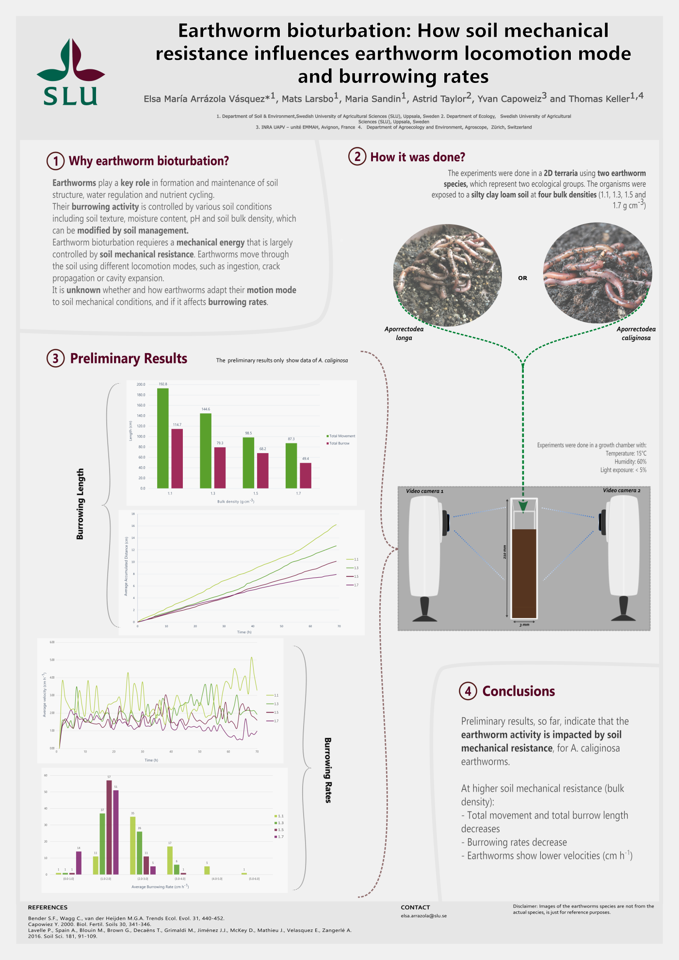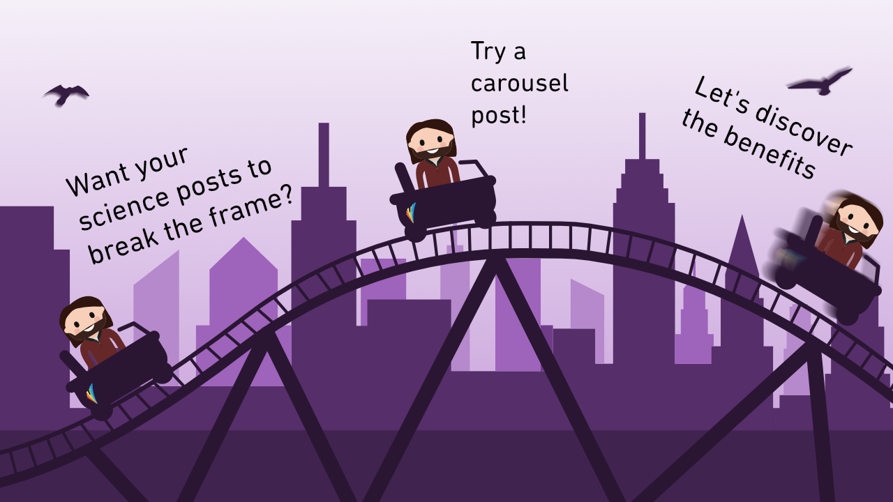
The carousel format
In a world where short-form videos have taken over, still images are having a hard time pushing through. However, there’s been a response – The Carousel. From sporting and musical events to scientific infographics, carousel posting has become an increasingly popular format for creating engaging posts consisting of still images.
In short, a carousel is just a slideshow of pictures. When it is perfectly executed, these pictures are integrated with each other, and not just a basic slideshow. For example, a carousel from a concert might look like this:
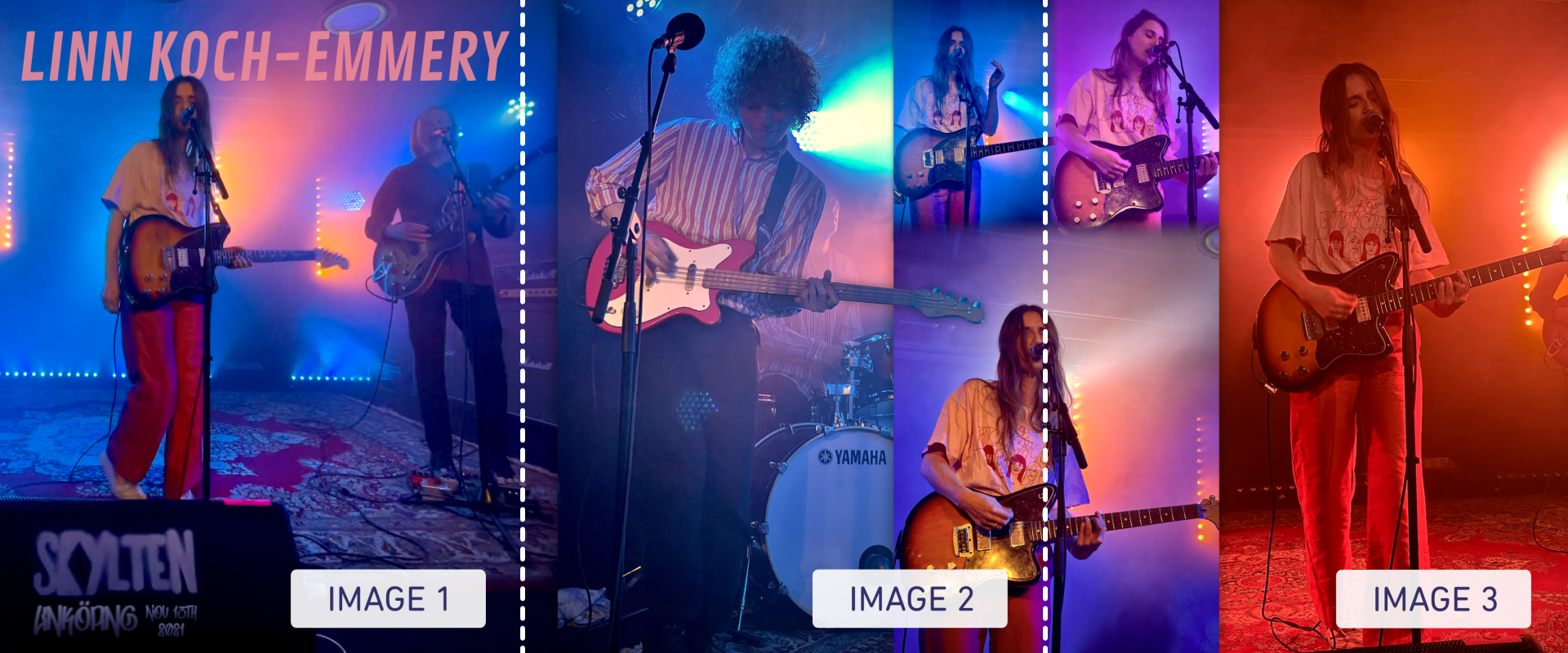
Three different tricks are used to make this carousel more immersive:
- Notice how the picture in image 1 extends to image 2, making it more intriguing to slide to reveal more.
- The bass guitar’s head in image 2 sort of extends beyond the picture, creating an additional sense of depth and making the carousel more enjoyable to swipe through.
- The three photos of the vocalists in images 2 and 3 use transparent gradients, unifying the images.
The scientific carousel
Obviously, science on social media is quite
different from sports and music. Instead of needing to combine multiple photos
to summarize an event, a scientist typically needs to combine figures, graphs,
and visuals to summarize an article. Sounds a bit like a graphical abstract,
right?
Much like the graphical abstract, the carousel is a concise infographic that may, for example, accompany a social media post when promoting a new publication. Thus, it’s an opportunity for a larger audience to notice the article and learn from it without having to read the full article.
But unlike the graphical abstract, the carousel communicates more information. For example, it isn’t limited to one single picture; it can consist of as many pictures as you like (or at least as many as the platform allows). It may even make sense to add a data visual in the carousel to display some of the main results. So content-wise, it’s perhaps closer to a poster.
Overall, the carousel offers scientists a bit more leeway when summarizing their work in a visually pleasing and effective way. Of course, the work doesn’t have to be an article, as the format and ideas work just as well for summarizing research projects, methods, or similar. Creative freedom!
Telling a story through a carousel
The carousel’s structure makes it an
appropriate tool for storytelling. Let’s have a look at a carousel I recently
made for an article about moral consistency during a crisis.
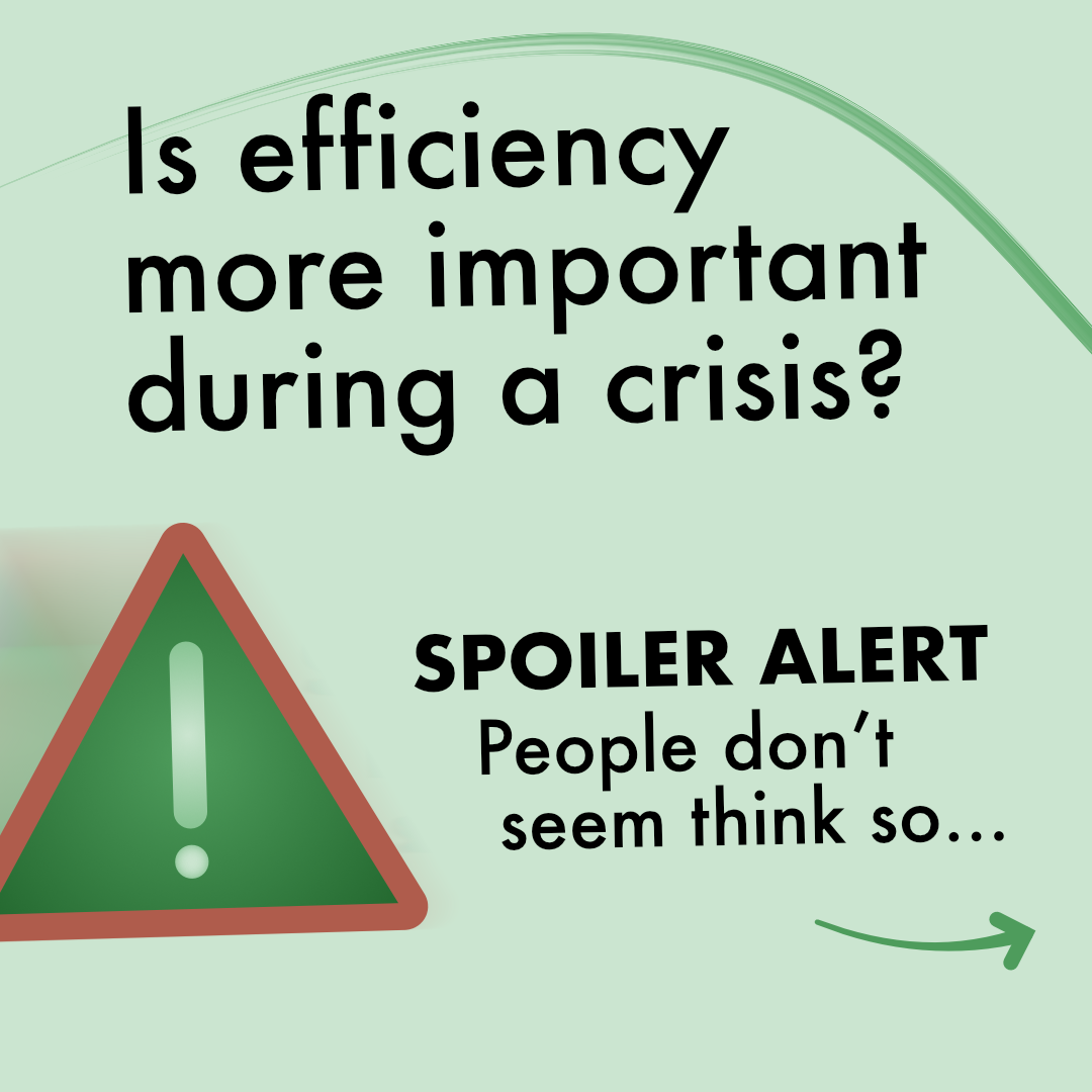
Image 1 – The Hook: The carousel starts
with a thought-provoking question. This is one possible hook, i.e., a
technique to grab the viewer’s attention. It’s important that you start off
with something you want viewers to remember, as most viewers won’t swipe
through the carousel.

Image 2 – Background: I continued by providing context, with the illustrations showing how budgets were allocated from medical treatments to ventilators and hospital beds, i.e., equipment needed for treating COVID-patients.
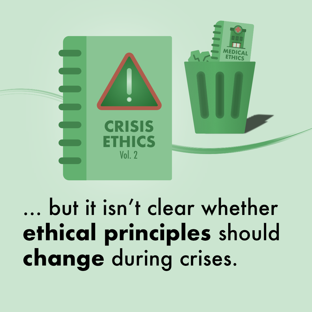
Image 3 – The conflict: Most stories rely on some sort of conflict, a but. In this case, I introduce that it isn’t clear whether the ethical principles should change during crises, illustrated with “crisis ethics” replacing medical ethics.
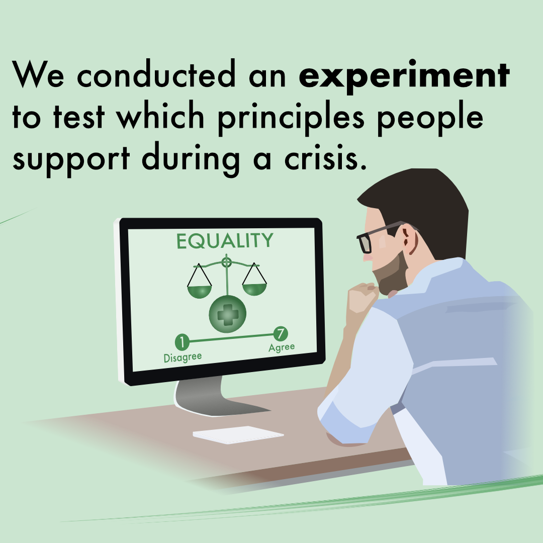
Image 4 – The experiment solution: The story continues with a therefore. To try resolving the conflict, we conducted an experiment to test which principles people support during a crisis. The illustration clarifies that i) it’s an online experiment and ii) that a 7-point Likert scale is used to measure support for an ethical principle, such as “equality”.
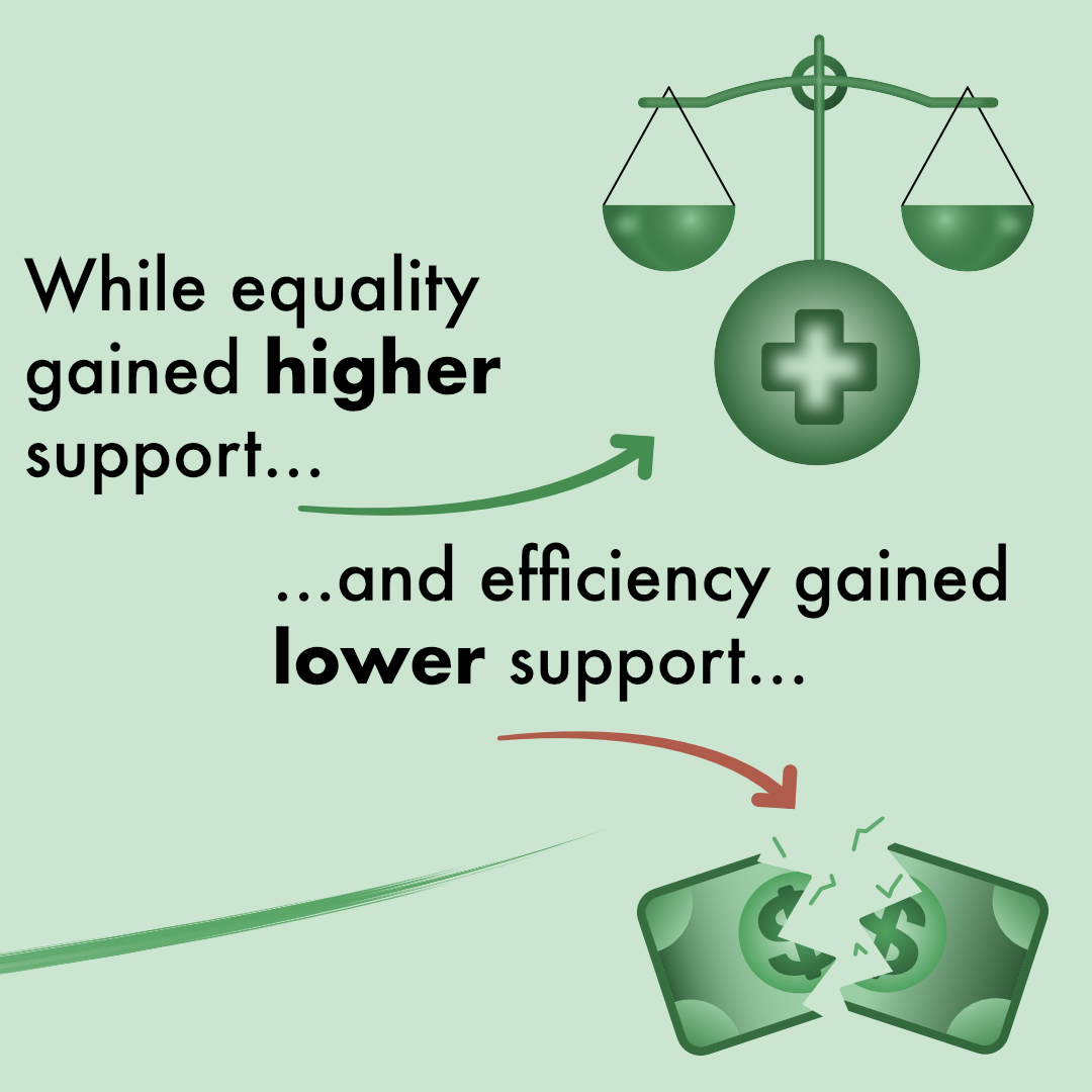
Image 5 – Results: At this point, it becomes tricky to progress the story without using too many slides. Remember, it’s social media and the viewers’ attention span is severely limited. Thus, results must be effectively presented in an engaging way, keeping the conflict alive. As always, the researcher must decide which results to focus on. I decided to focus on 2 results, that support for equality increased and support for efficiency decreased, reusing illustrations for these two concepts from before.
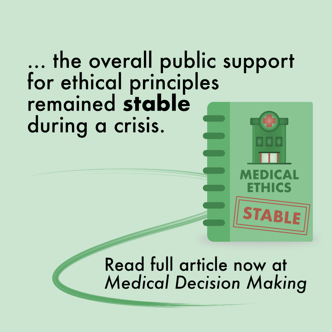
Image 6 – Conclusion: Finally, it’s time to end the ride and wrap up the carousel. Here, it’s generally a good idea to repeat your main message. In our case, I nuanced the results with the main conclusion being that support was stable. I also added a call to action, encouraging viewers to read the full article.
Why the carousel works
There are multiple reasons why the
algorithm favors carousels over regular image posts:
First off, the format is designed to make viewers spend more time on the post. This signals to the algorithm that the post is valuable content, compared to having a single image where all information can be more quickly assessed and then scrolled on.
Of course, this doesn’t mean you should make your graphics difficult to understand so people look at them longer (they’ll probably keep on swiping if it’s too hard to comprehend). Instead, it’s about making the graphics more engaging, making people want to spend more time with them.
Second, its versatility makes it perfect for science communication. Just like in my previous example, it can be used to tell a whole story (e.g., of an article). In addition, the slide-by-slide design makes it perfect for explaining methods or processes step-by-step.
Third, and this holds especially true for Instagram, the post gets a second chance in the feed. If a viewer doesn’t scroll through the carousel the first time they see the post, then the second image will appear later in their feed. Thus, the carousel gets a second chance, and perhaps this time, the viewer will scroll through it.